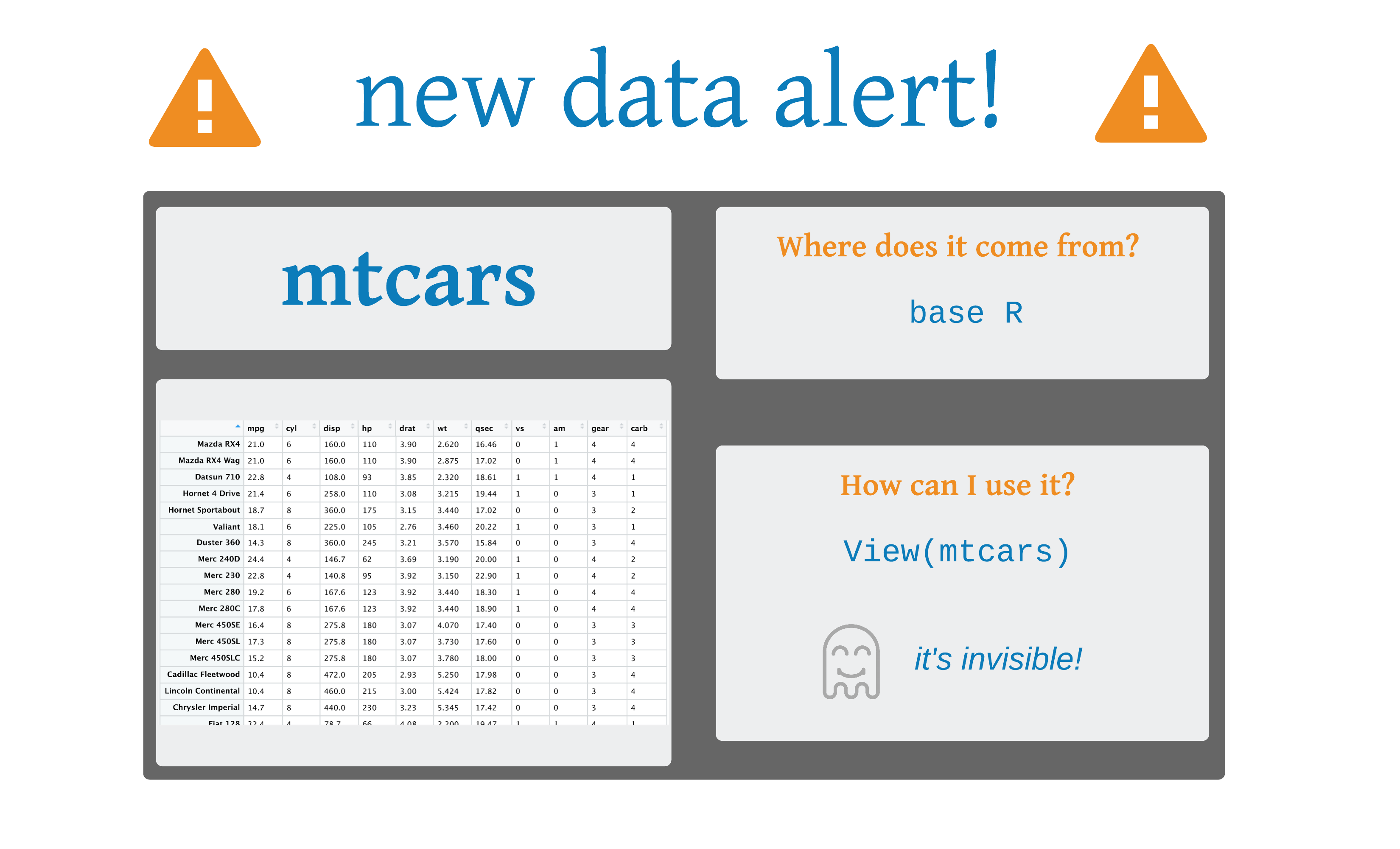
 Art by Allison Horst
ggplot()
ggplot(mtcars, aes(x = mpg, y = hp))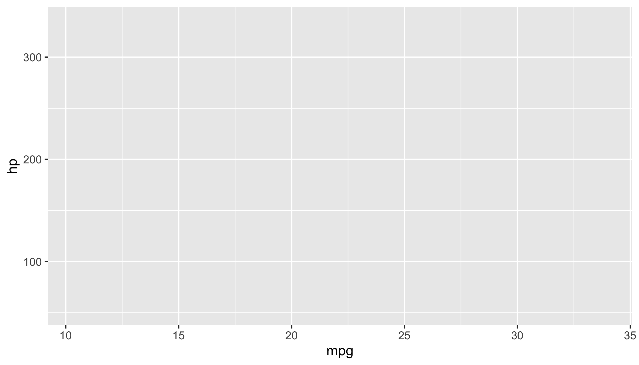
ggplot(mtcars, aes(x = mpg, y = hp)) + geom_point()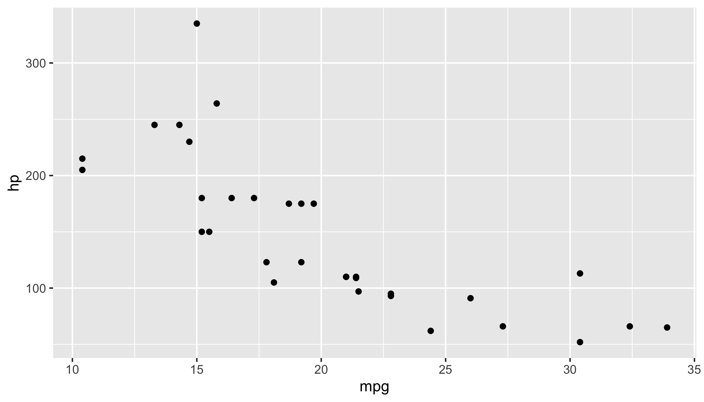
diabetes <- read_csv("diabetes.csv")ggplot(data = diabetes, mapping = aes(x = weight, y = hip)) + geom_point()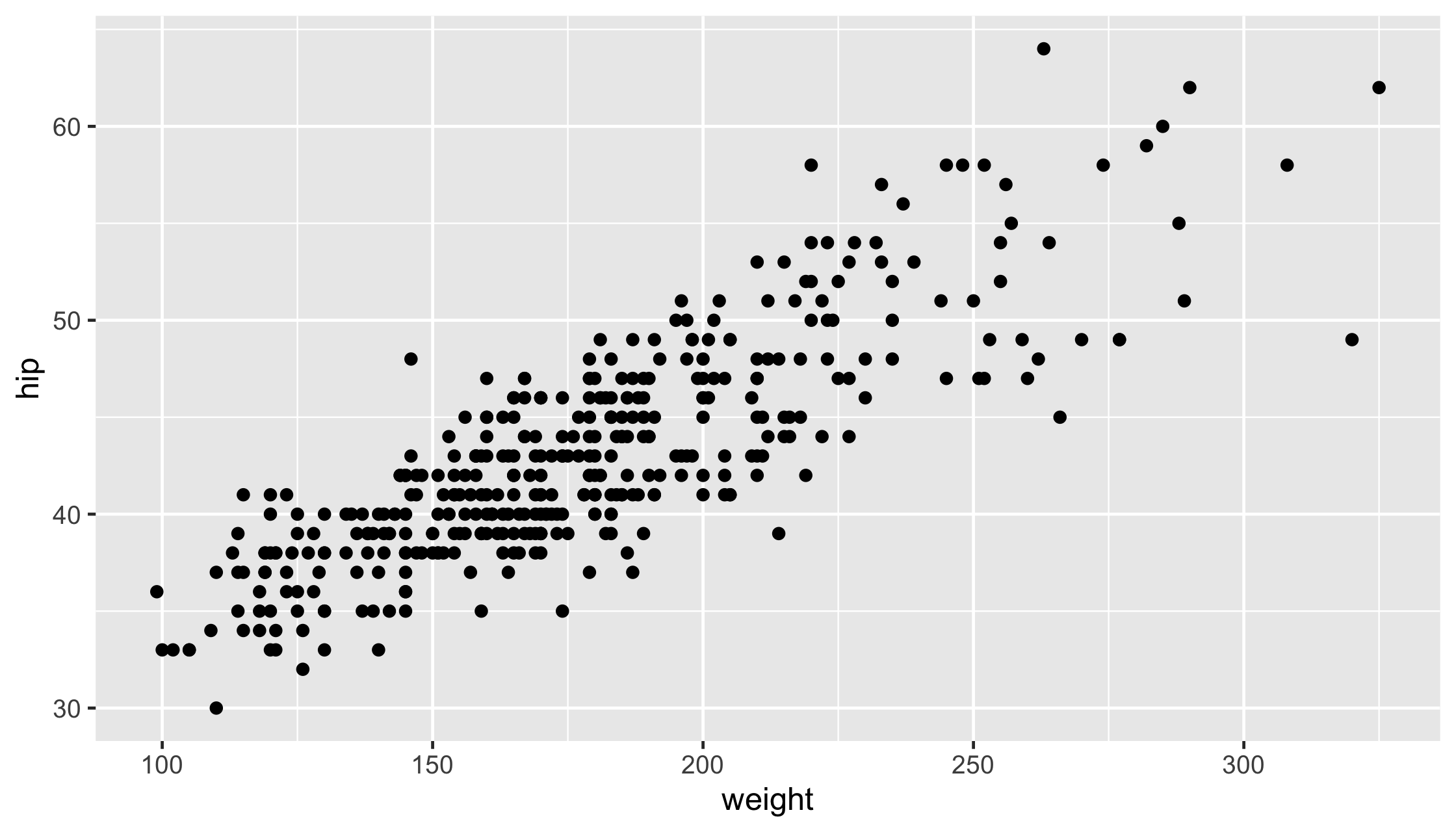
ggplot( data = diabetes, mapping = aes(x = weight, y = hip, color = gender)) + geom_point()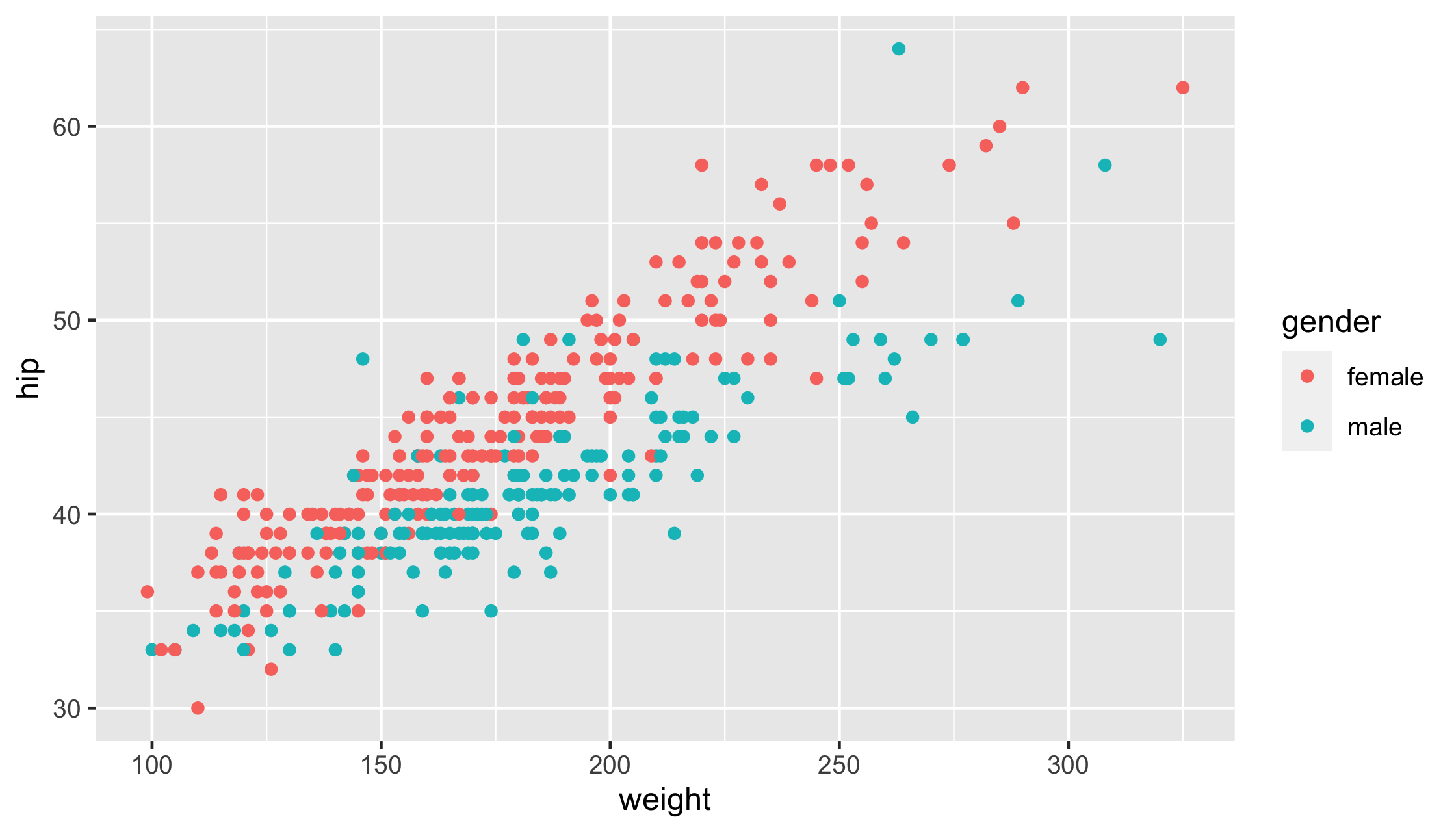
ggplot( data = diabetes, mapping = aes(x = weight, y = hip, size = gender)) + geom_point()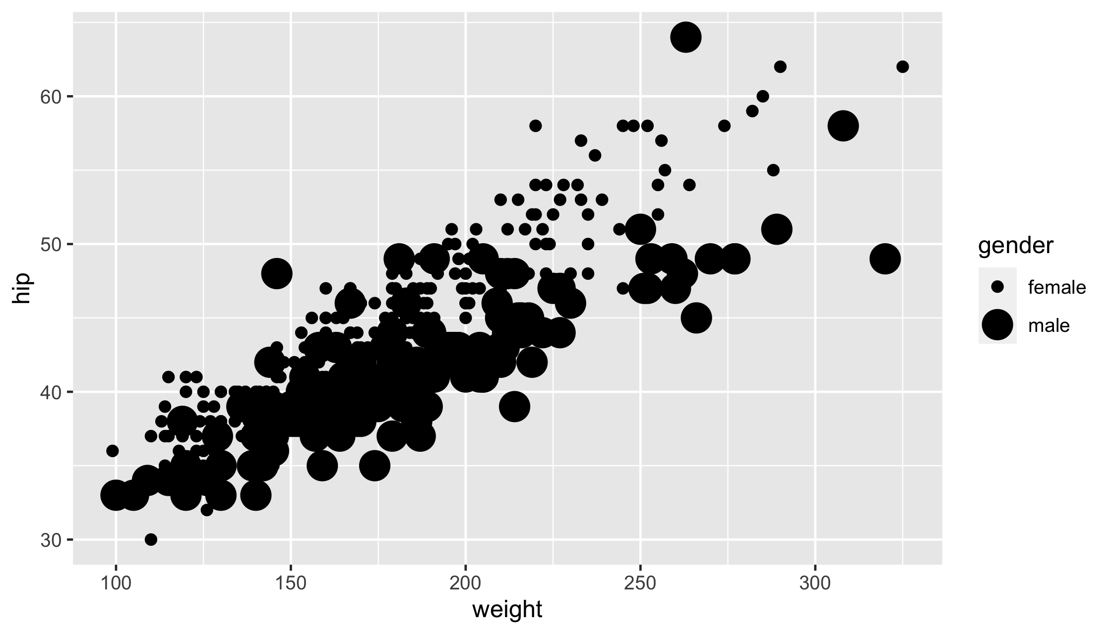
ggplot( data = diabetes, mapping = aes(x = weight, y = hip, alpha = gender)) + geom_point()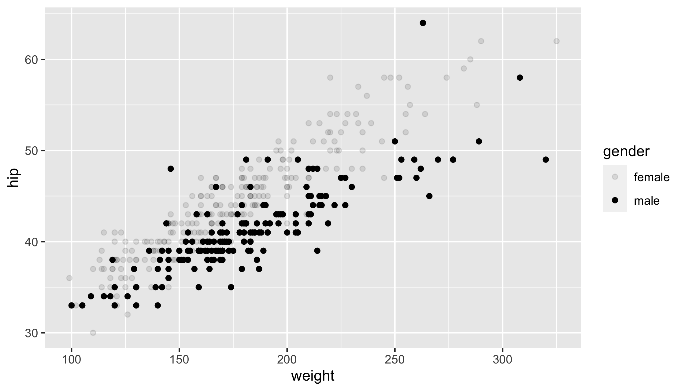
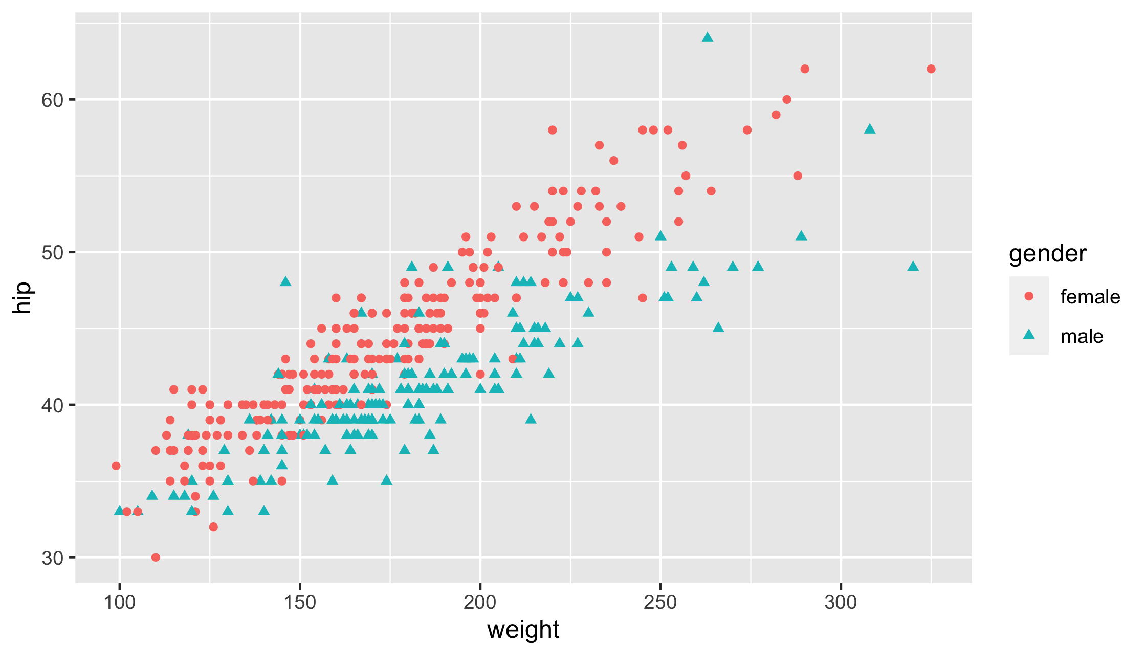
ggplot( data = diabetes, mapping = aes(x = weight, y = hip, shape = gender)) + geom_point()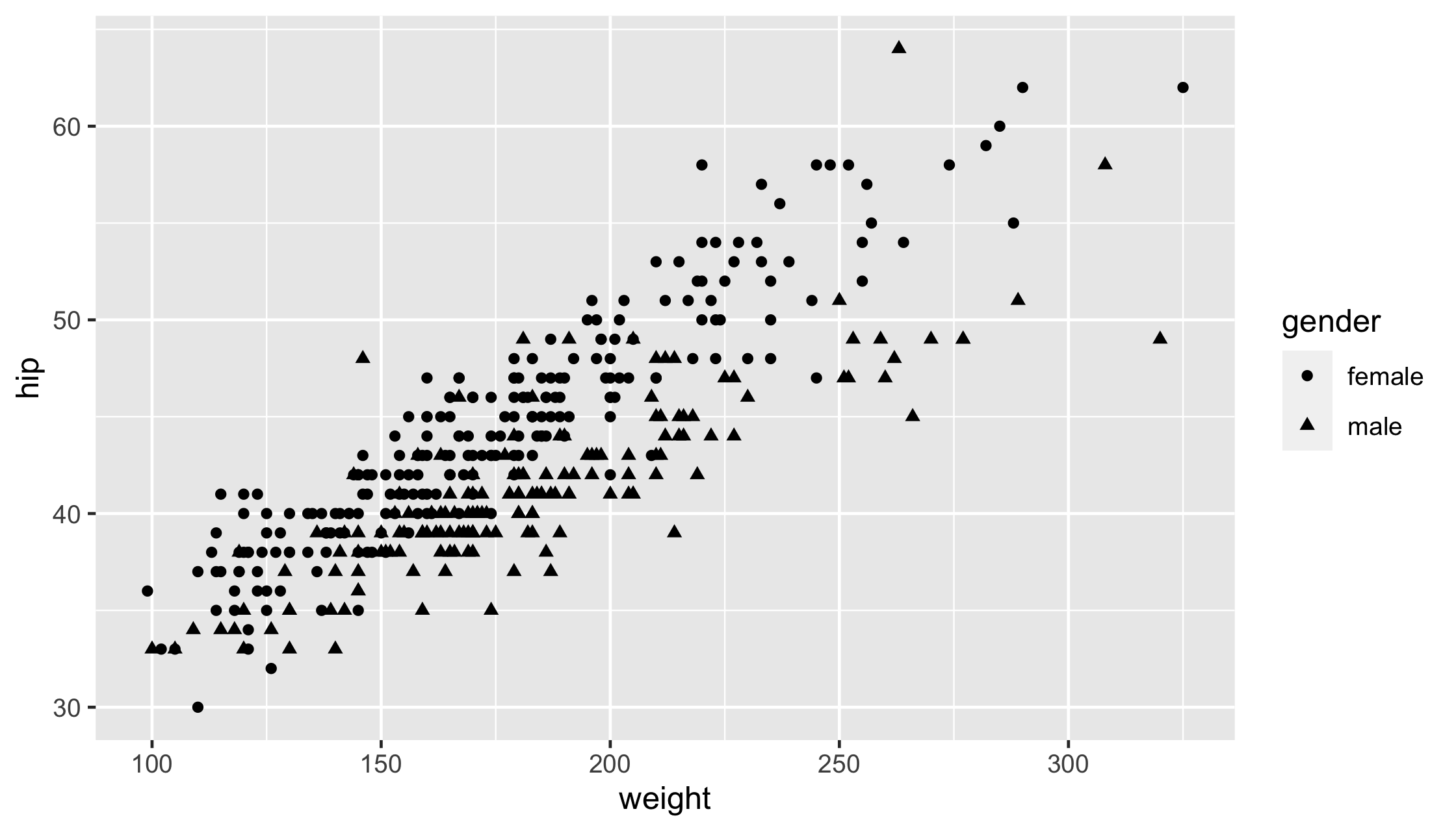
ggplot(diabetes, aes(gender, chol)) + geom_boxplot()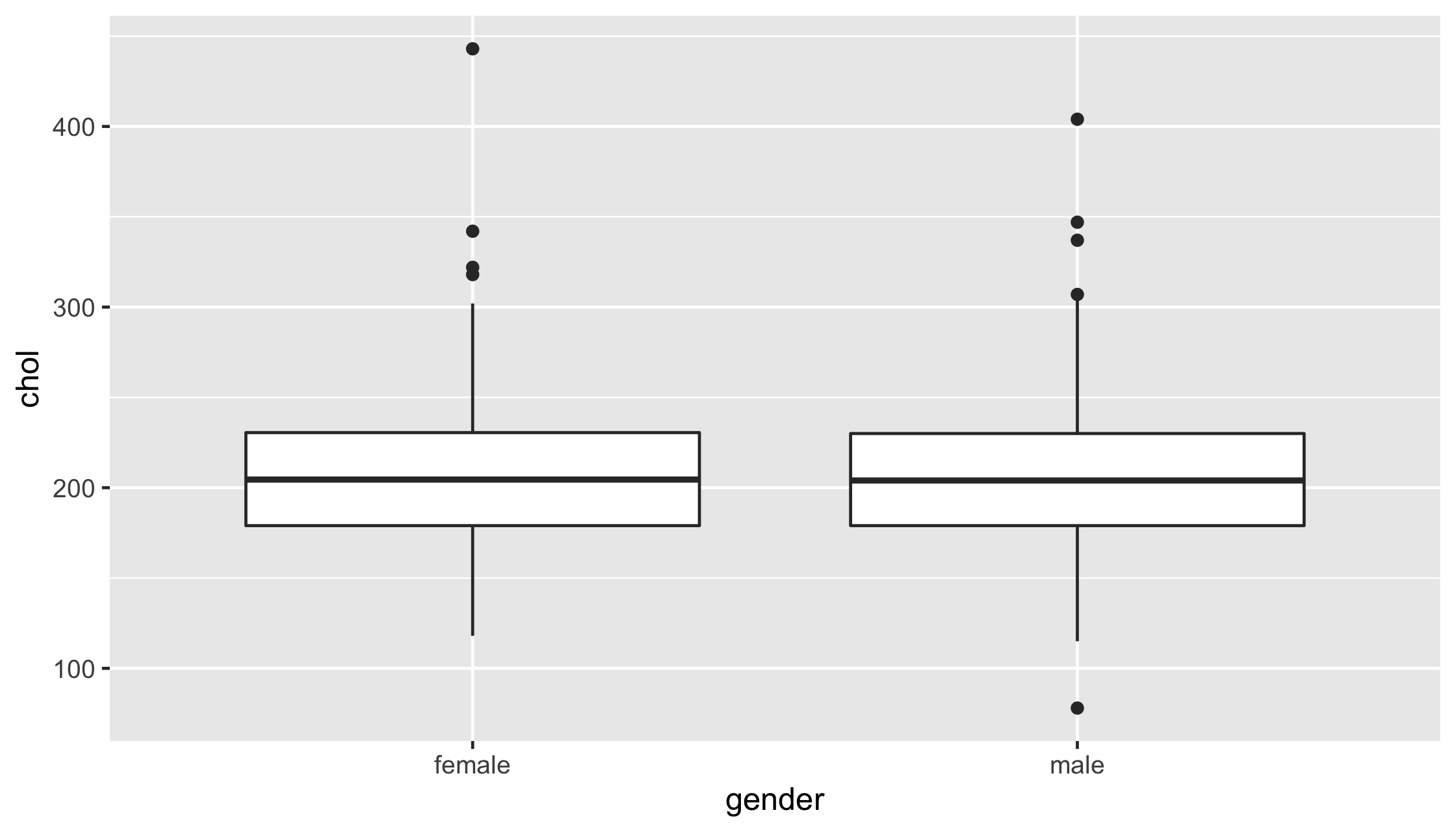
ggplot(diabetes, aes(x = glyhb)) + geom_histogram()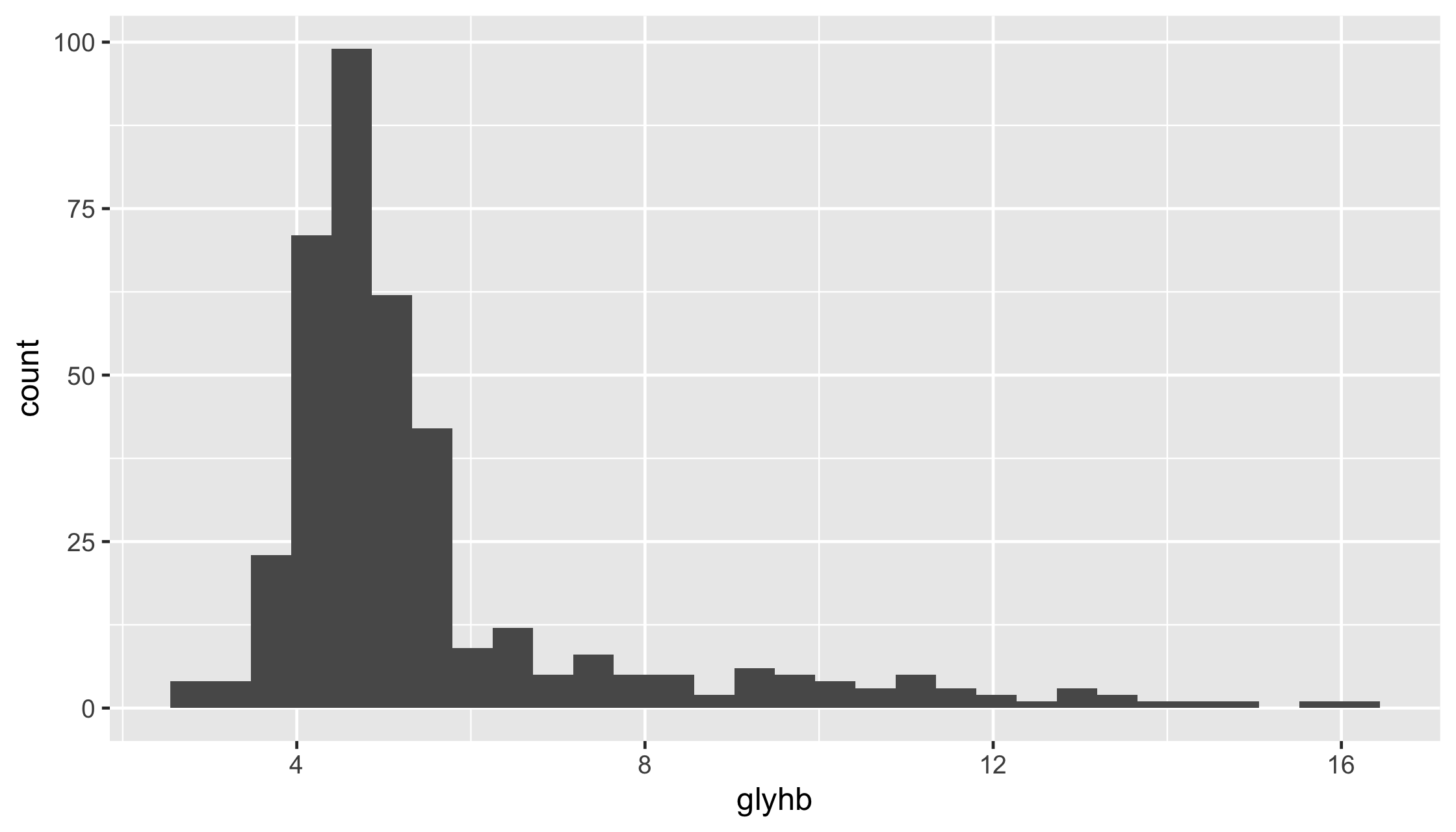
ggplot(diabetes, aes(x = glyhb)) + geom_density()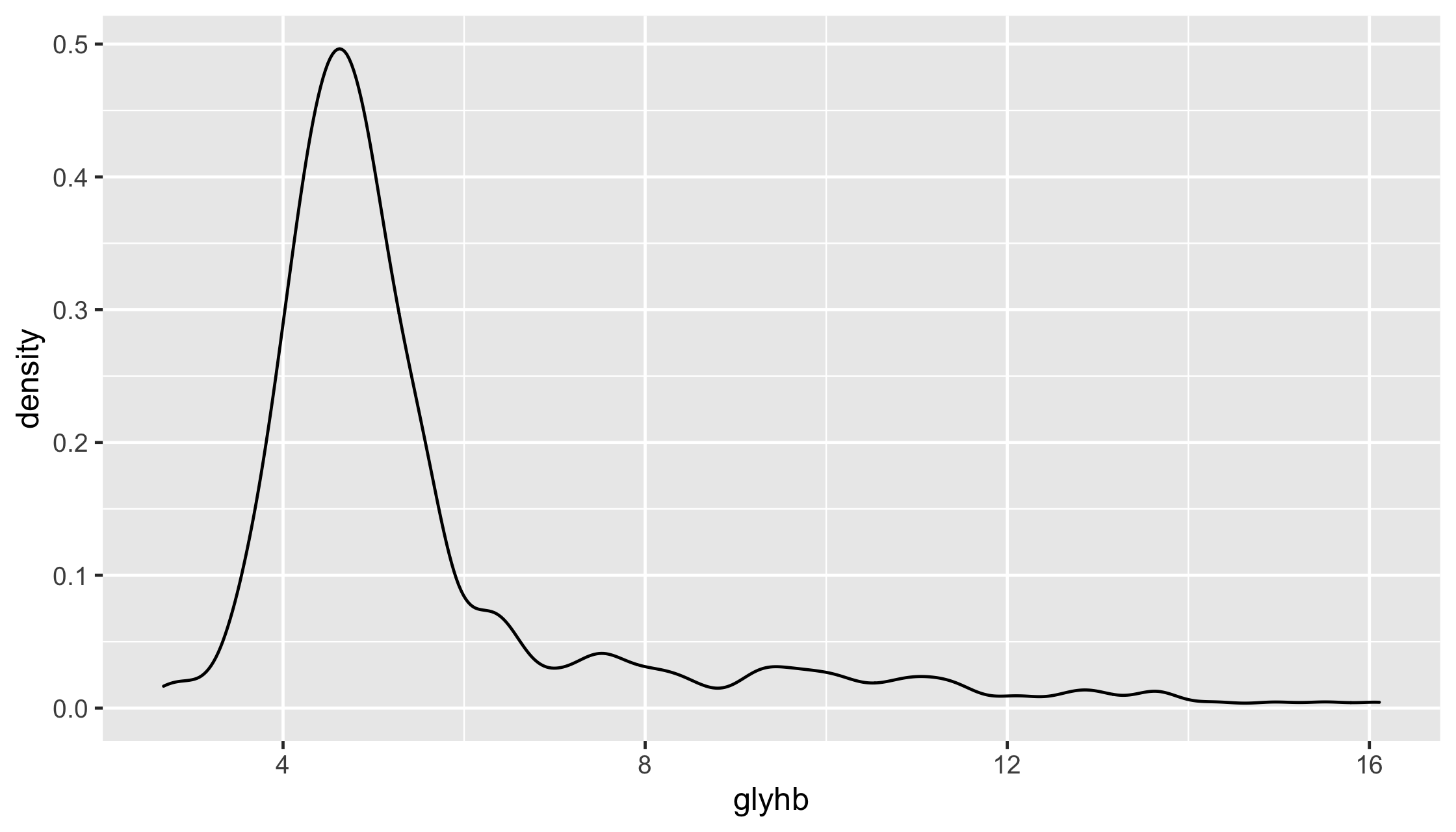
diabetes %>% ggplot(aes(x = frame)) + geom_bar()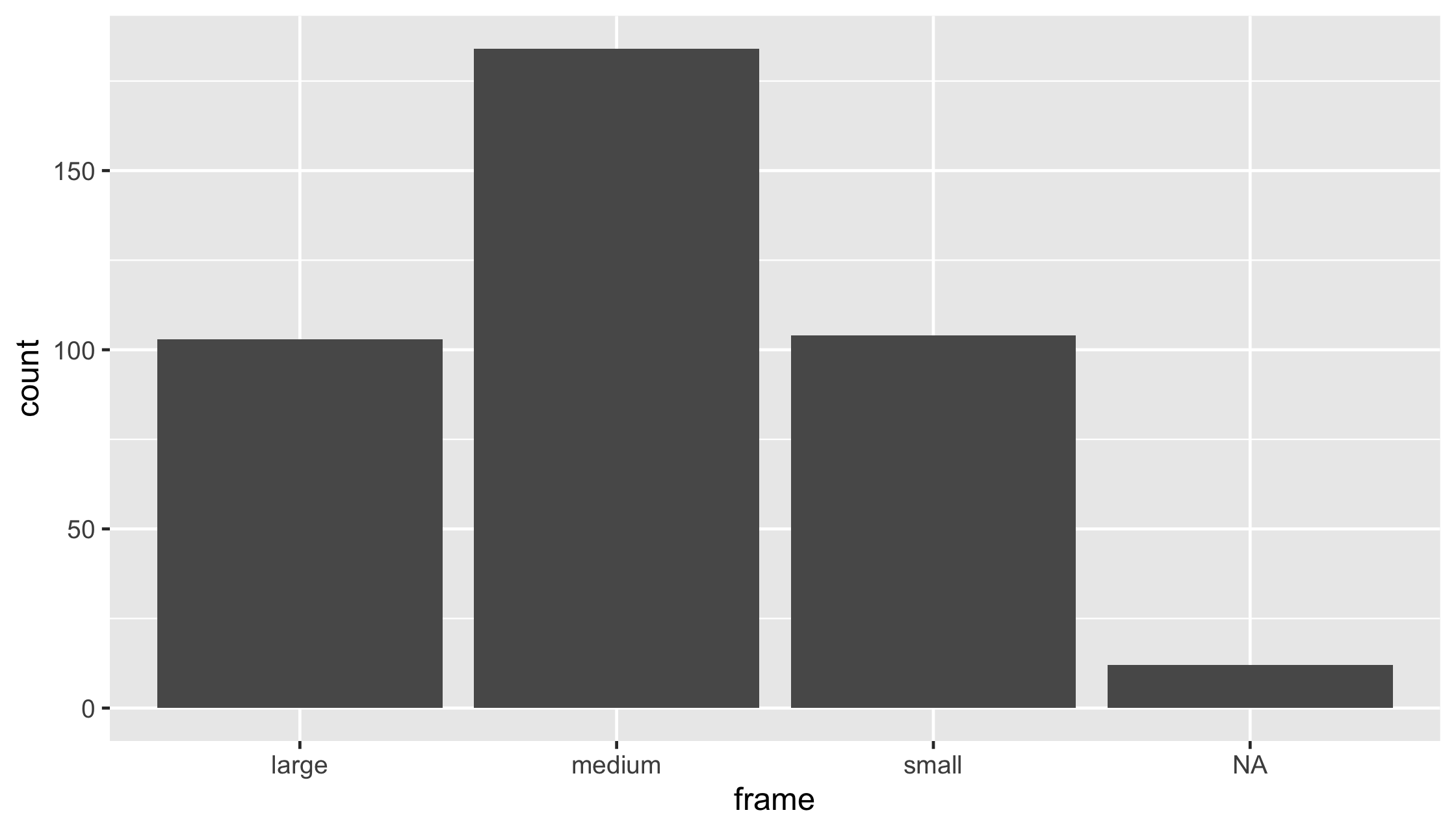
diabetes %>% drop_na() %>% ggplot(aes(x = frame)) + geom_bar()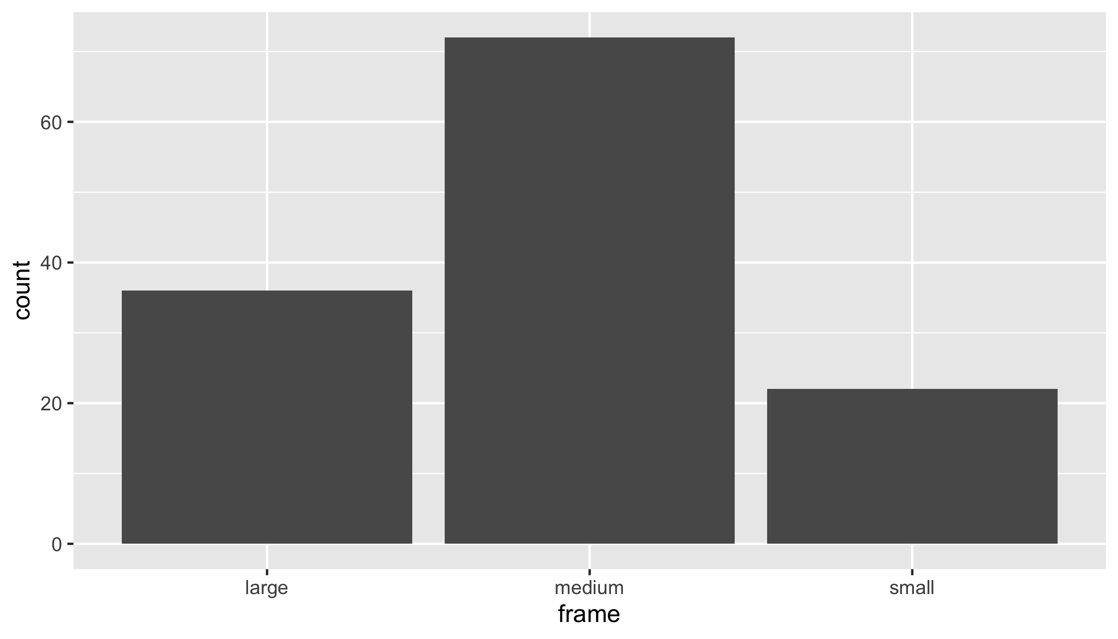
diabetes %>% drop_na() %>% ggplot(aes(x = frame, fill = gender)) + geom_bar()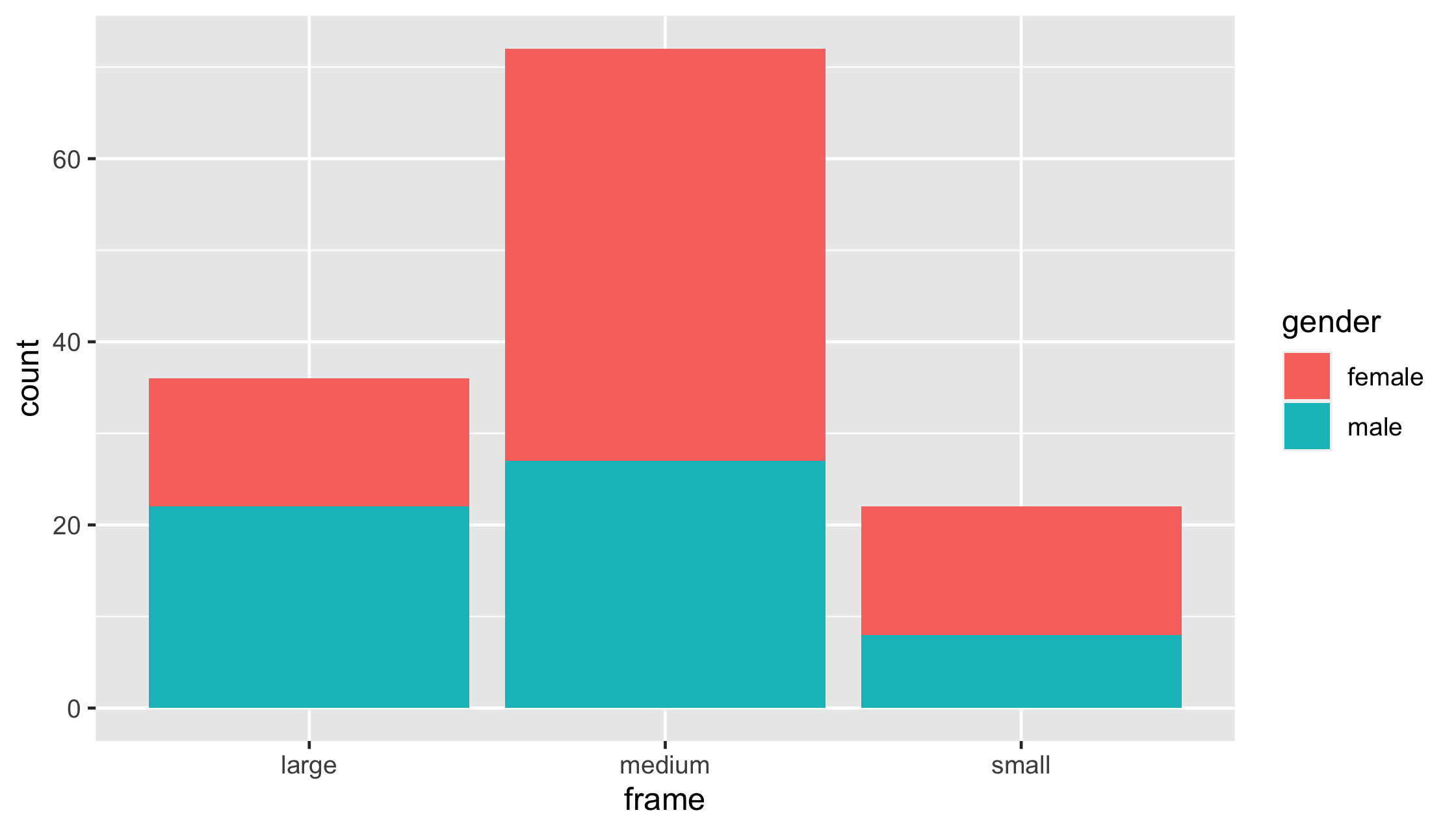
ggplot(mtcars, aes(x = factor(am), y = hp)) + geom_point()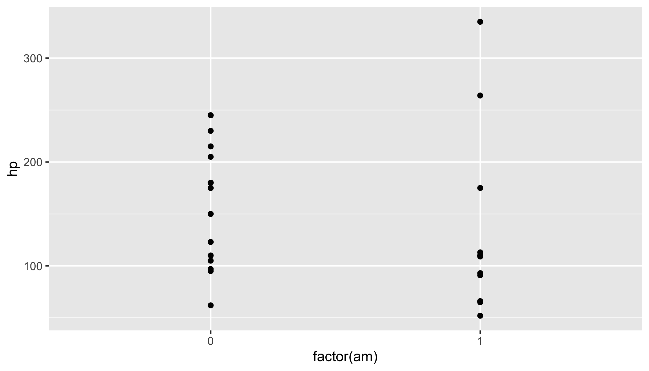
ggplot(mtcars, aes(x = factor(am), y = hp)) + geom_point(position = "jitter")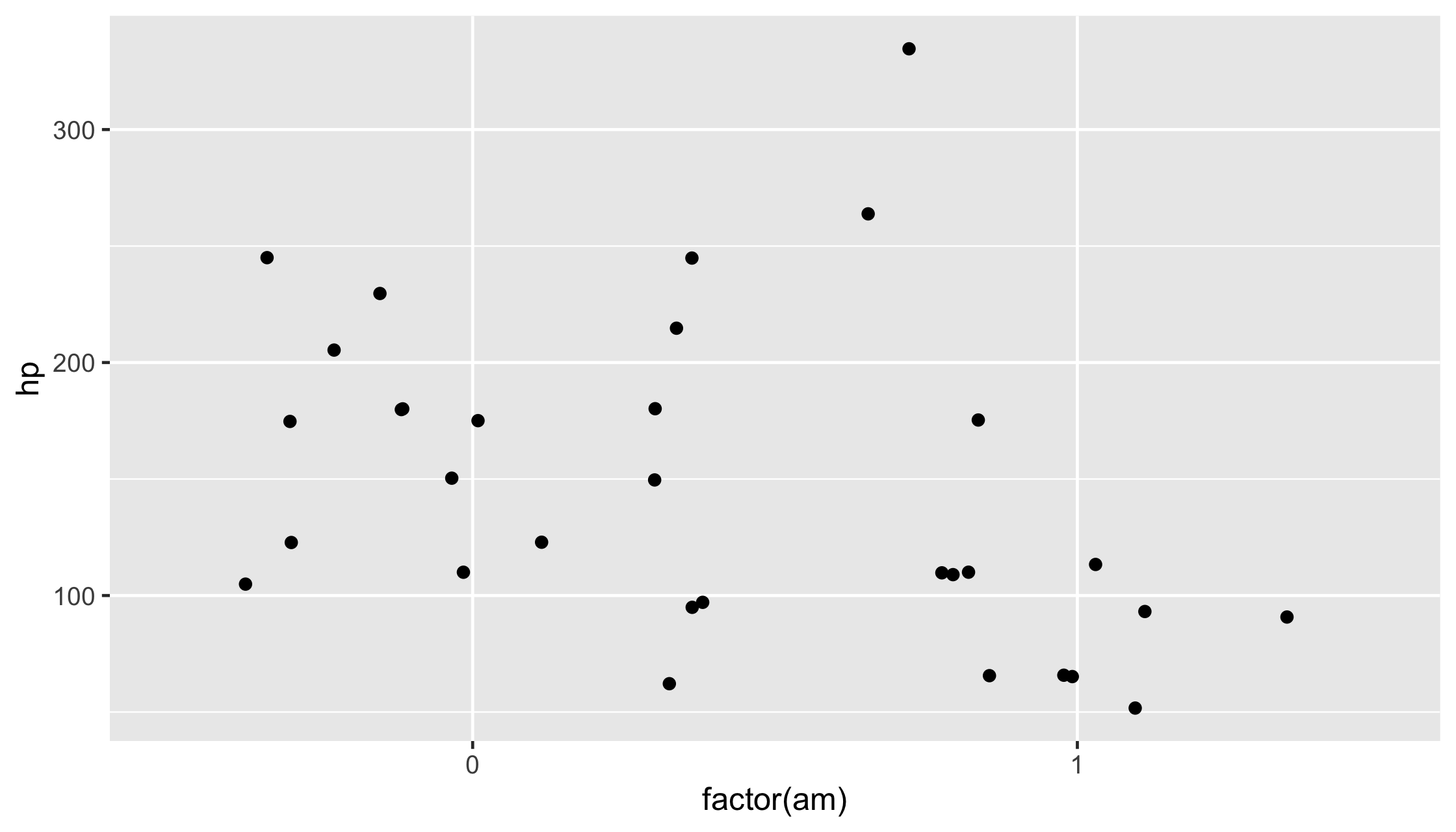
ggplot(mtcars, aes(x = factor(am), y = hp)) + geom_jitter(width = .1, height = 0)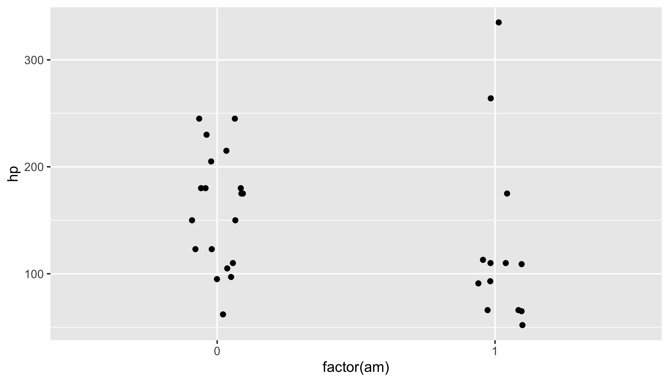
diabetes %>% drop_na() %>% ggplot(aes(x = frame, fill = gender)) + geom_bar(position = "stack")
diabetes %>% drop_na() %>% ggplot(aes(x = frame, fill = gender)) + geom_bar(position = "dodge")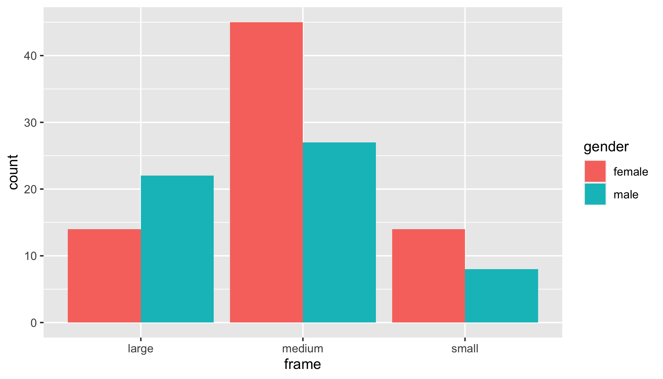
diabetes %>% drop_na() %>% ggplot(aes(x = frame, fill = gender)) + geom_bar(position = "fill")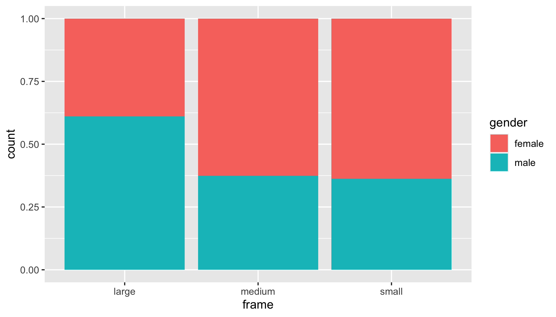
ggplot(mtcars, aes(x = mpg, y = hp, color = cyl)) + geom_point(color = "blue")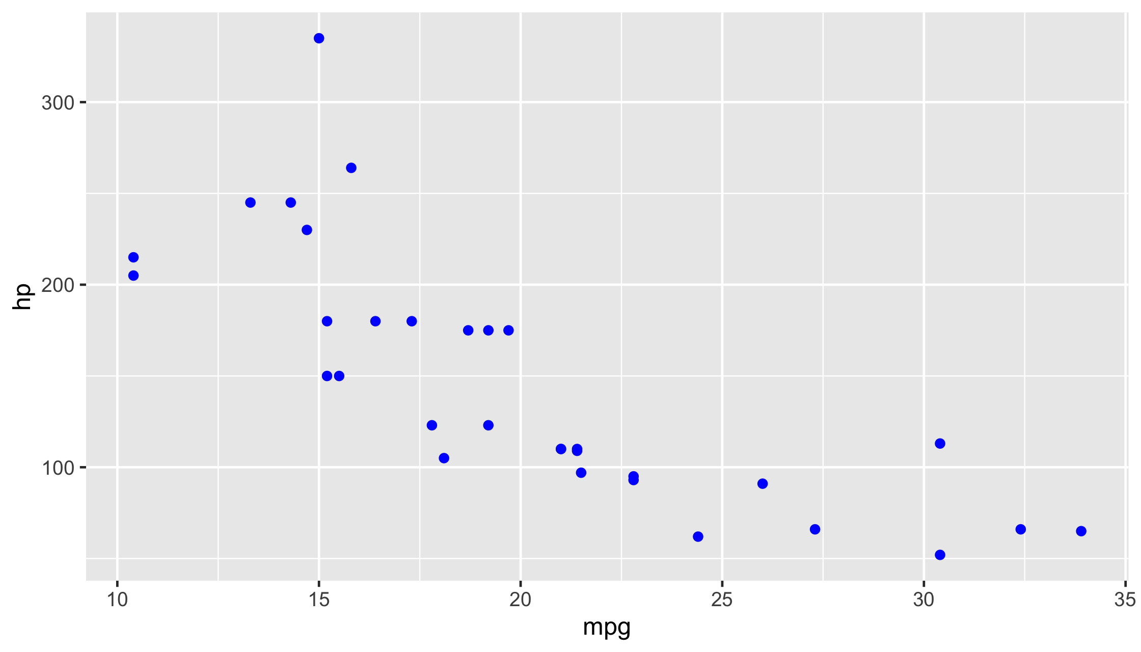
ggplot(mtcars, aes(x = mpg, y = hp, color = cyl)) + geom_point(aes(color = "blue"))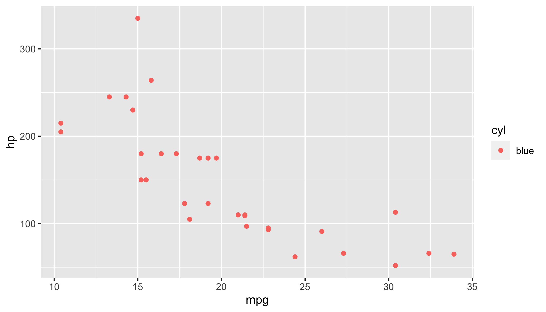
ggplot(mtcars, aes(x = cyl)) + geom_bar(color = "blue")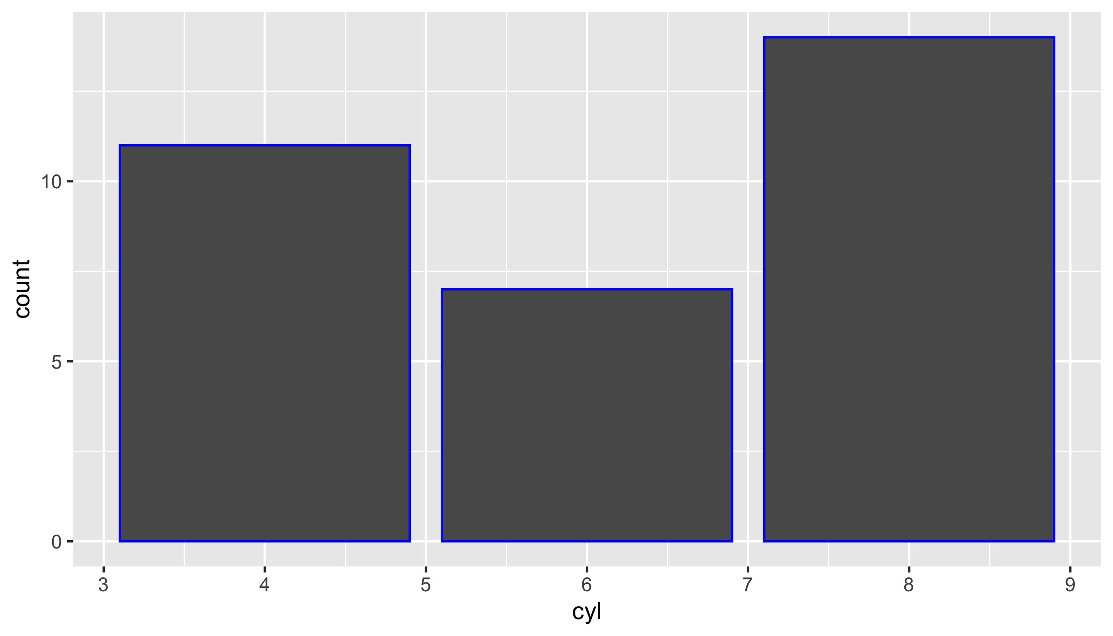
ggplot(mtcars, aes(x = cyl)) + geom_bar(fill = "blue")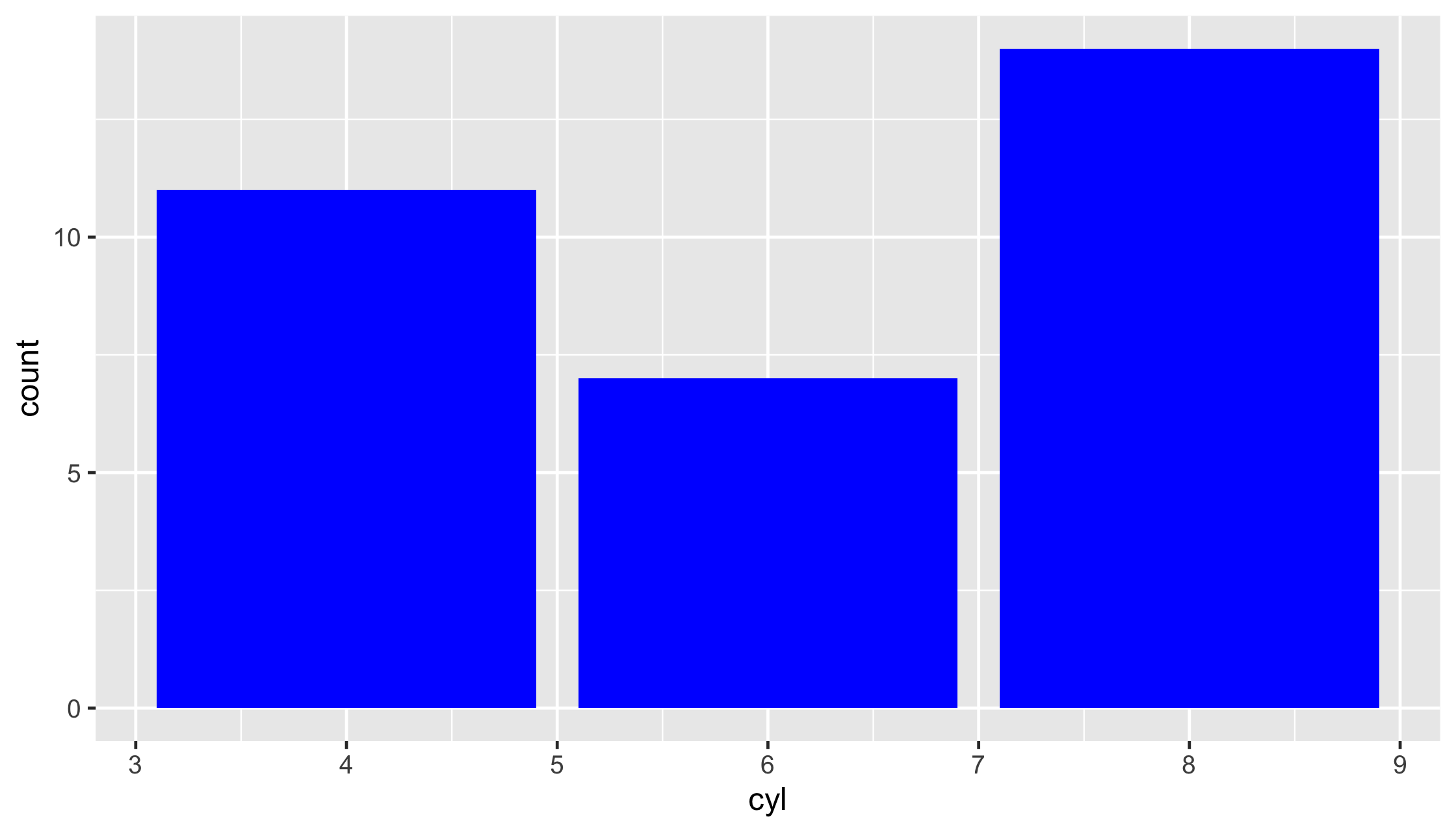
ggplot(mtcars, aes(x = cyl)) + geom_bar(color = "red", fill = "blue")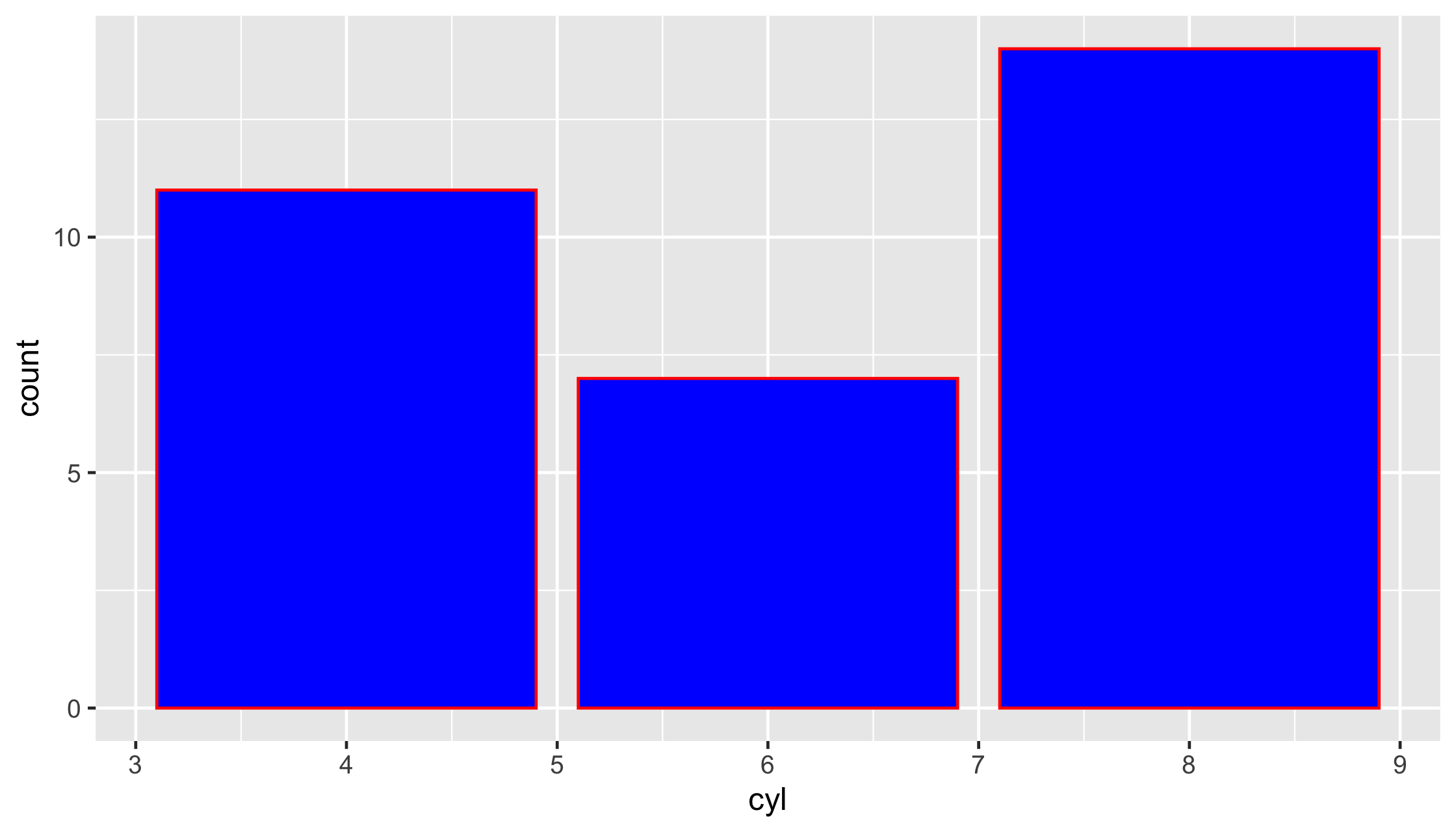
ggplot(diabetes, aes(weight, hip)) + geom_point() + geom_smooth()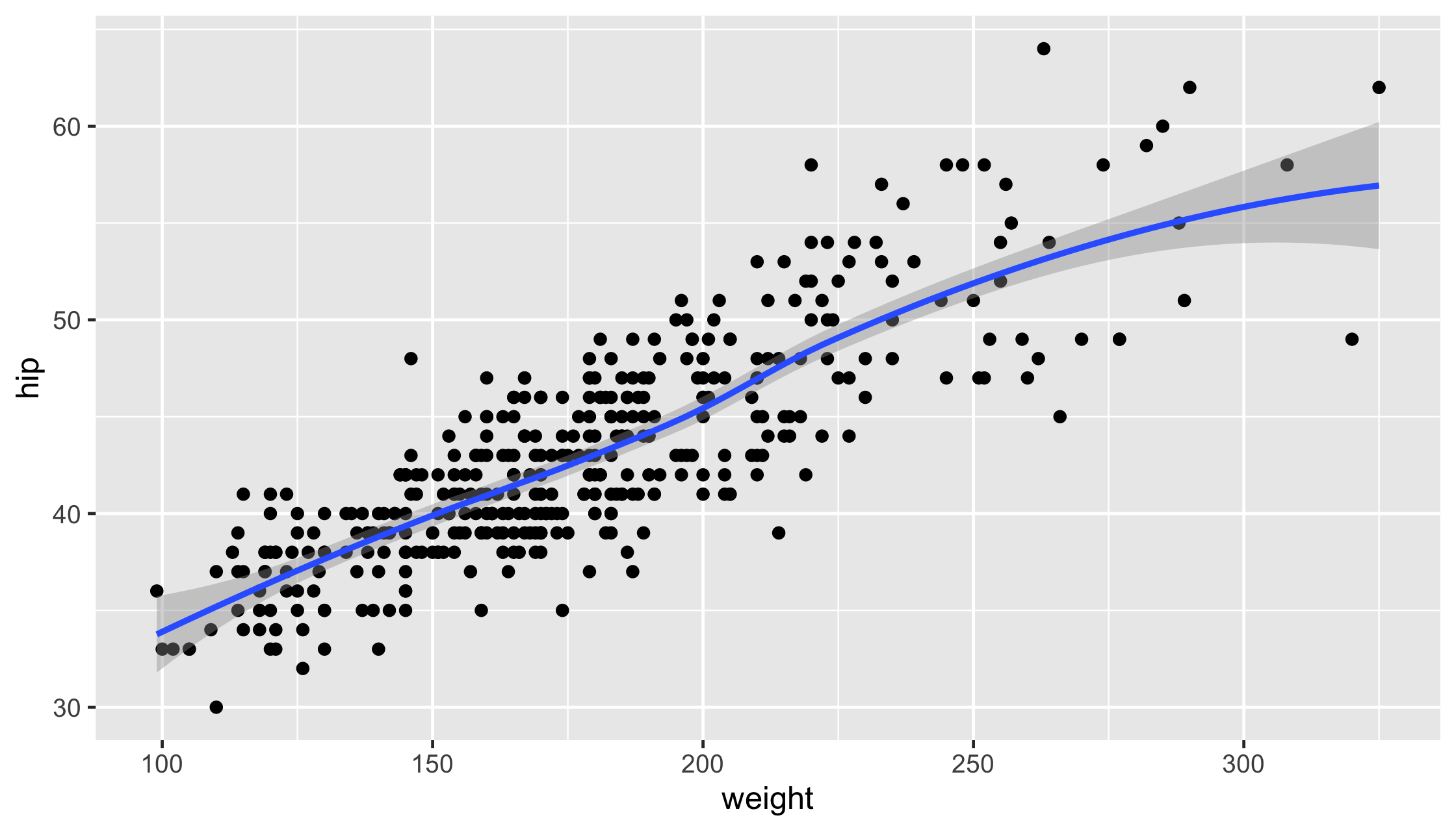
ggplot(diabetes, aes(weight, hip)) + geom_point() + geom_smooth(aes(linetype = gender))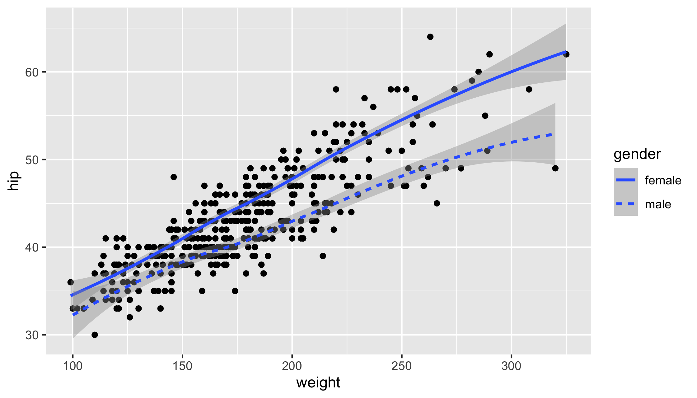
ggplot(diabetes, aes(weight, hip)) + geom_point() + geom_smooth(aes(linetype = gender), col = "black")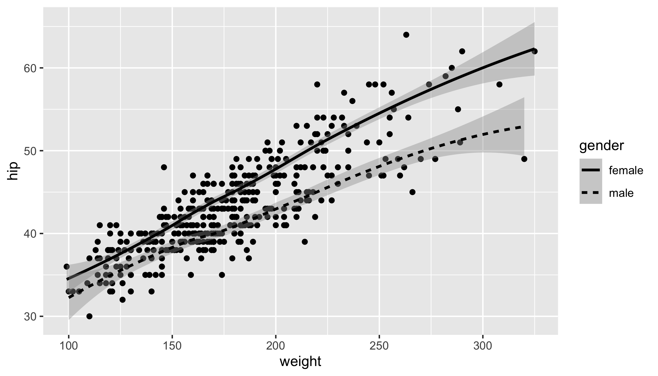
ggplot(diabetes, aes(weight, hip)) + geom_point() + geom_smooth(aes(linetype = gender), col = "black", se = FALSE)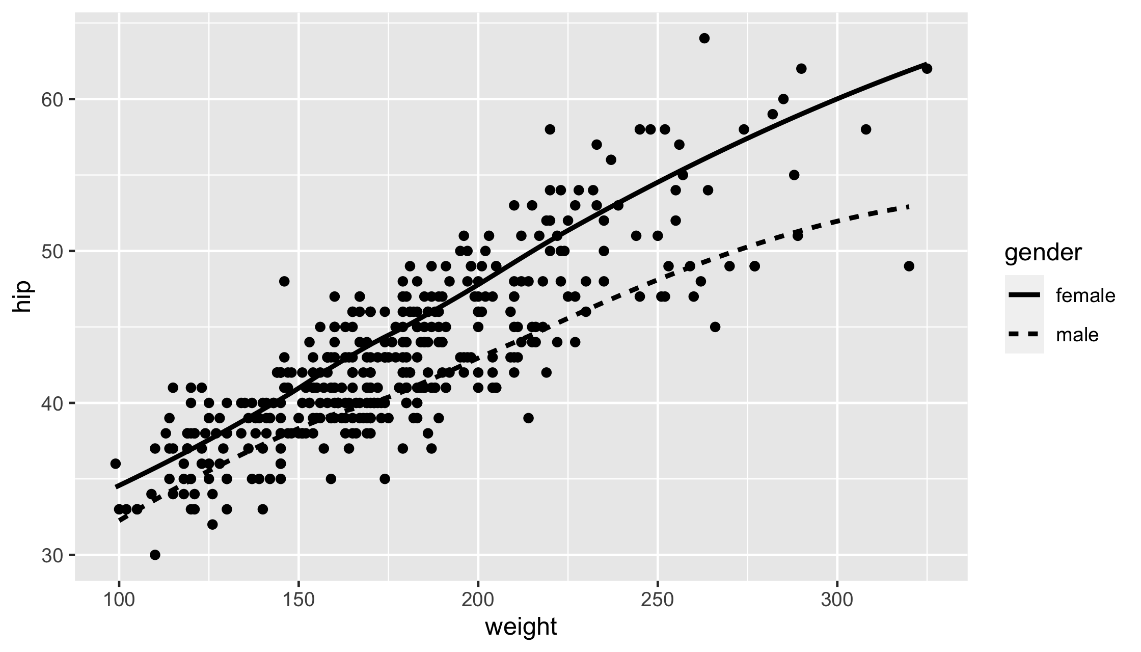
ggplot(diabetes, aes(weight, hip)) + geom_point(alpha = .2) + geom_smooth(aes(linetype = gender), col = "black", se = FALSE)
ggplot(diabetes, aes(weight, hip)) + geom_jitter(alpha = .2) + geom_smooth(aes(linetype = gender), col = "black", se = FALSE)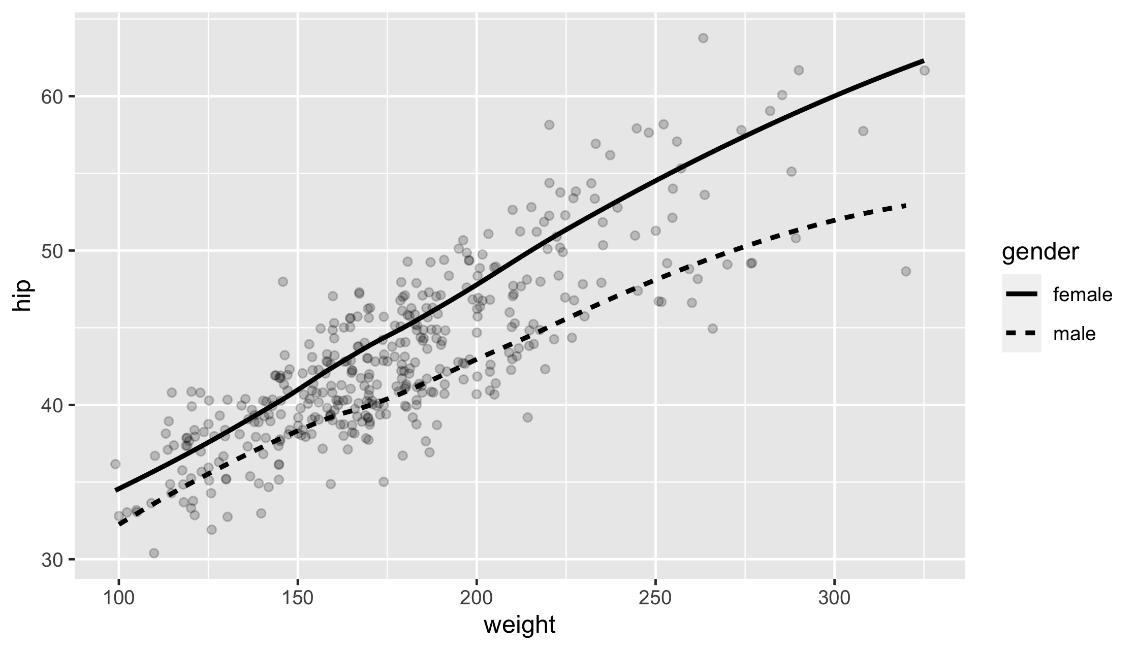
ggplot(diabetes, aes(weight, hip)) + geom_jitter(alpha = .2) + geom_smooth(aes(linetype = gender), col = "black", se = FALSE) + theme_bw()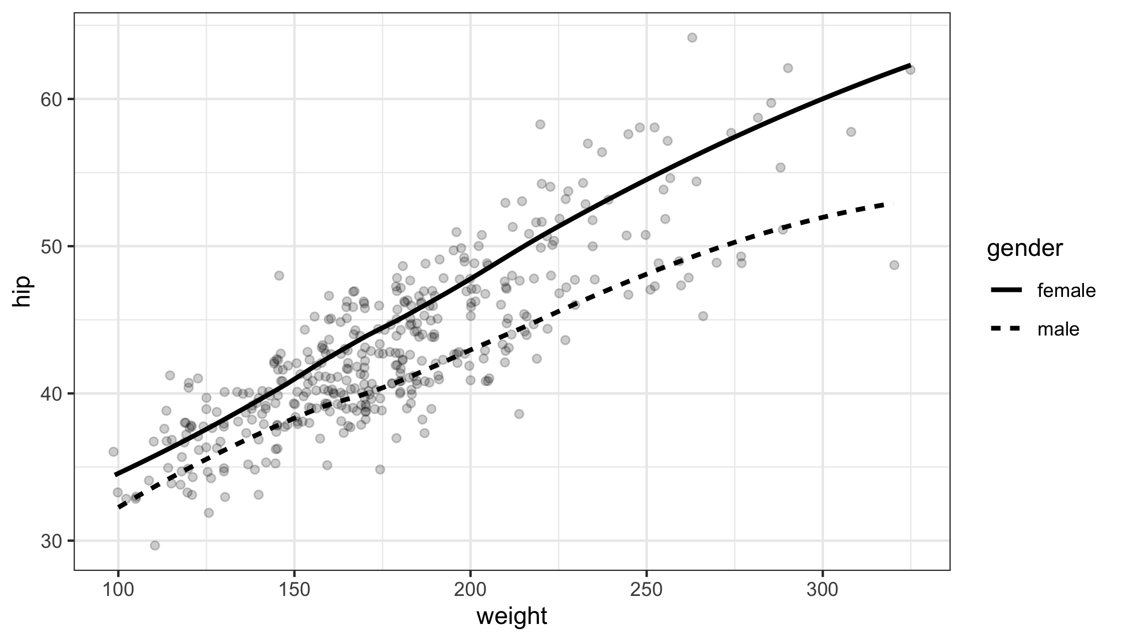
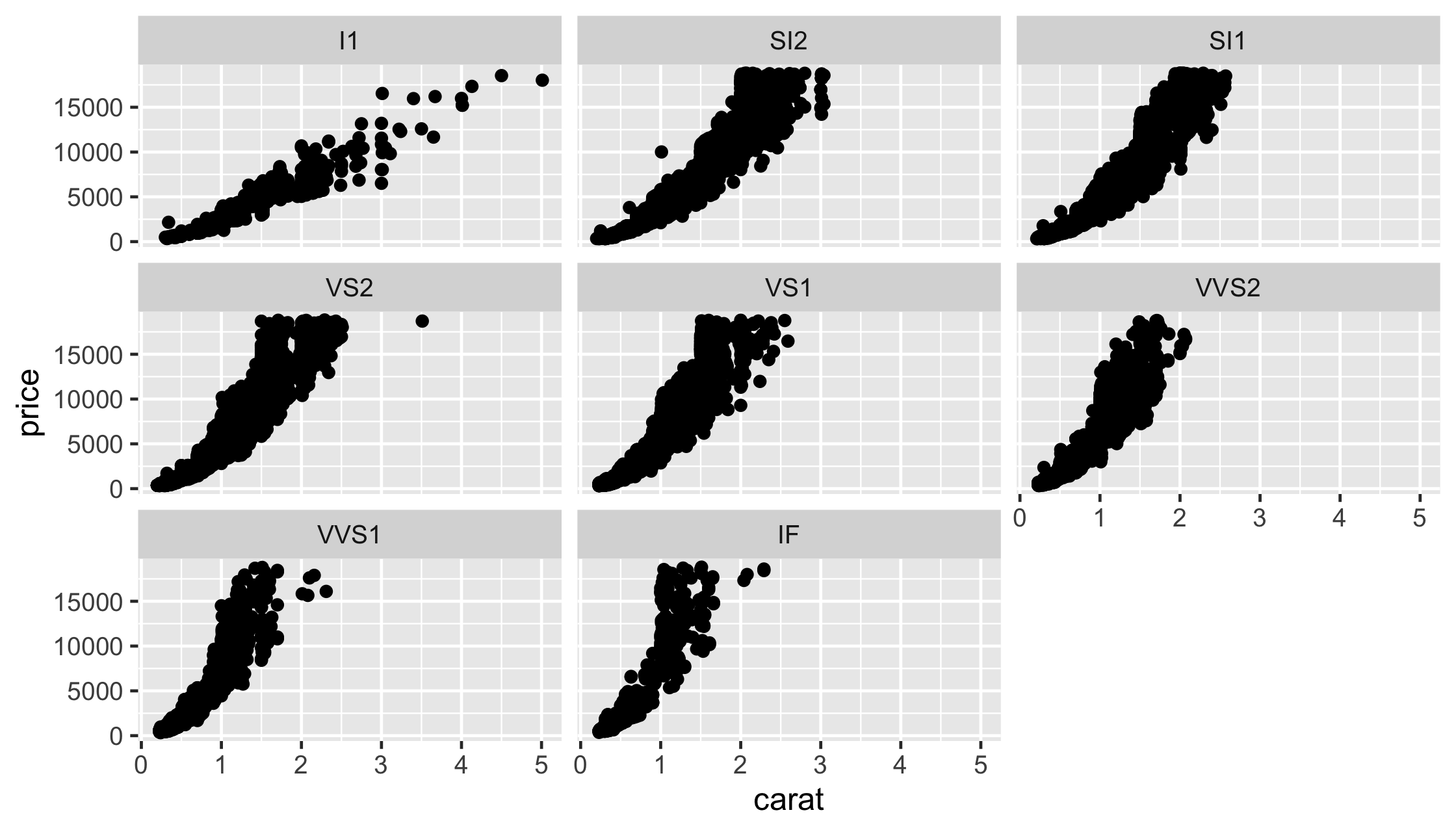
diamonds %>% ggplot(aes(x = carat, price)) + geom_point() + facet_grid(rows = vars(cut), cols = vars(clarity))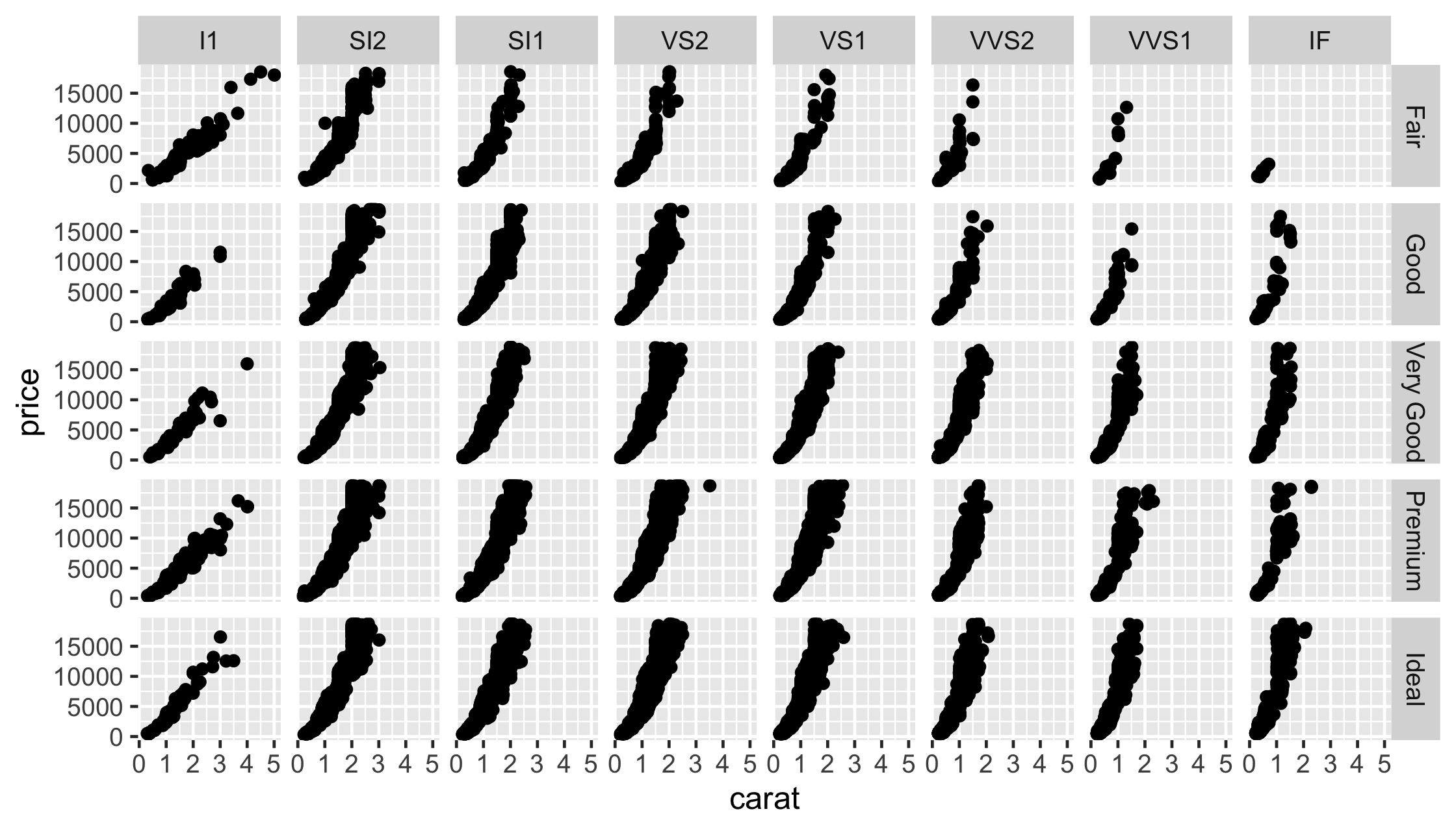
ggplot(diabetes, aes(weight, hip)) + geom_point() + geom_smooth() + facet_grid(rows = vars(gender), cols = vars(location))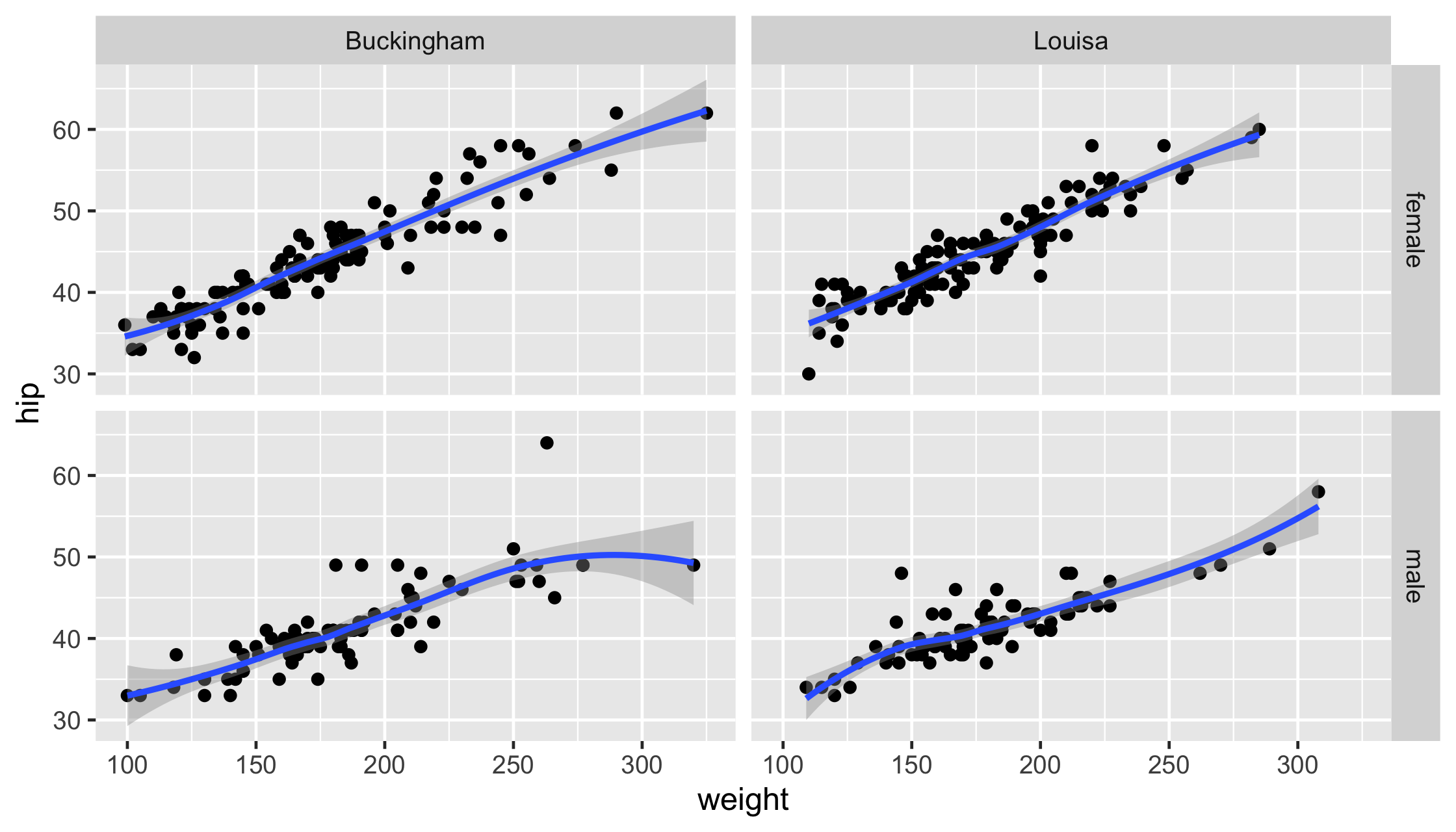
facet_wrap()