Data Visualization in R
customizing ggplot2
2020-08-22
1 / 54
Scales
2 / 54
Scales
position scales
2 / 54
Scales
position scales
scale_x_continuous()
scale_y_date()
scale_x_log10()
2 / 54
Scales
aesthetic scales
3 / 54
Scales
aesthetic scales
scale_color_hue()
scale_fill_brewer()
scale_shape_manual()
3 / 54
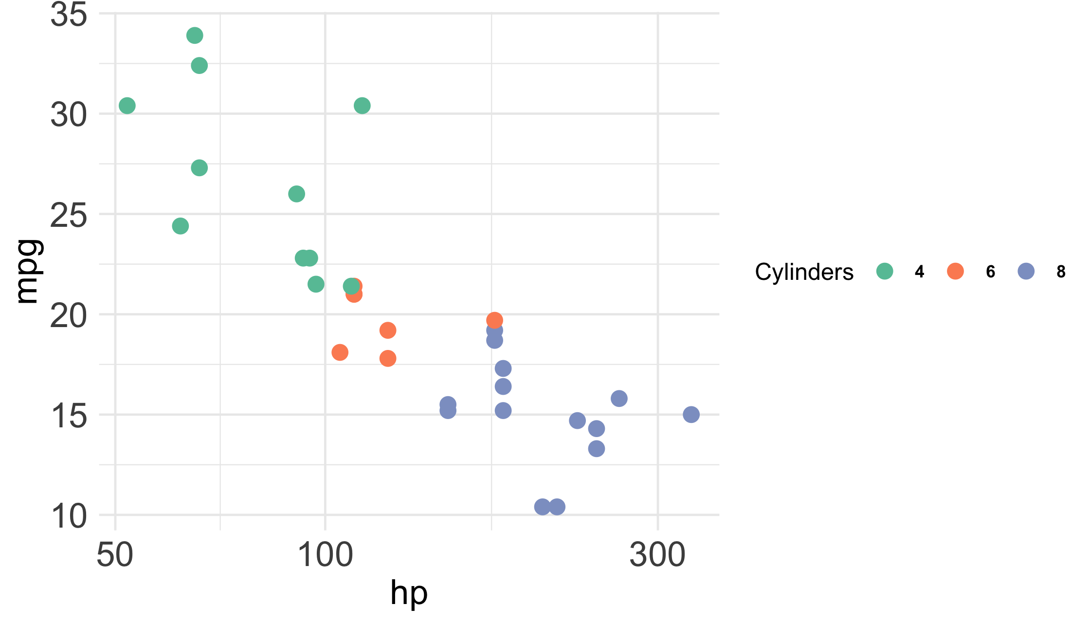
mtcars %>% ggplot(aes(hp, mpg, col = factor(cyl))) + geom_point() + scale_x_log10() + scale_color_brewer(palette = "Set2")4 / 54
mtcars %>% ggplot(aes(hp, mpg, col = factor(cyl))) + geom_point() + scale_x_log10() + scale_color_brewer(palette = "Set2")5 / 54
mtcars %>% ggplot(aes(hp, mpg, col = factor(cyl))) + geom_point() + scale_x_log10() + scale_color_brewer(palette = "Set2")6 / 54
mtcars %>% ggplot(aes(hp, mpg, col = factor(cyl))) + geom_point() + scale_x_log10() + scale_color_brewer(palette = "Set2")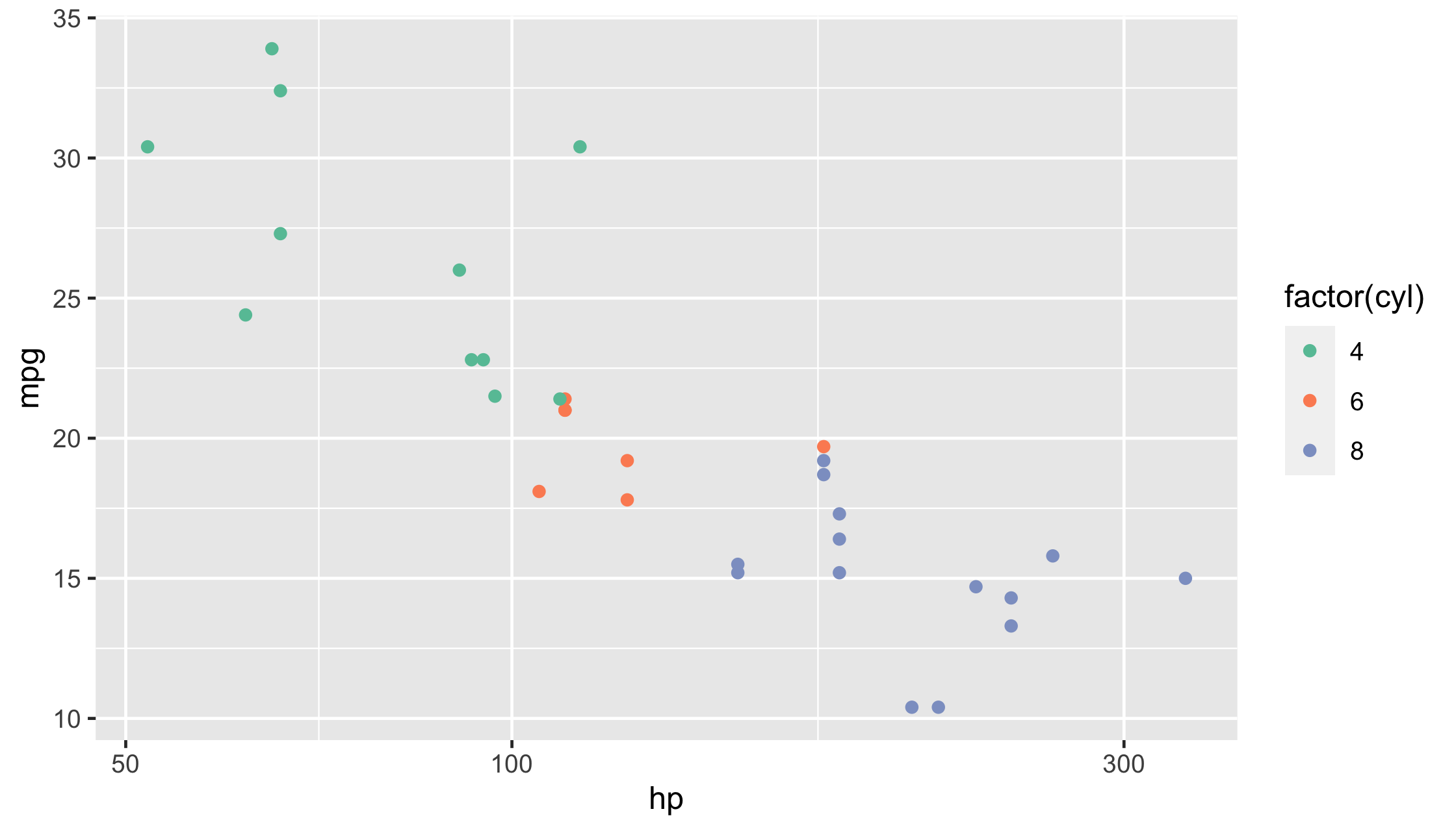
7 / 54
Your Turn 10
1. Change the color scale by adding a scale layer. Experiment with scale_color_distiller() and scale_color_viridis_c(). Check the help pages for different palette options.
2. Set the color aesthetic to gender. Try scale_color_brewer().
3. Set the colors manually with scale_color_manual(). Use values = c("#E69F00", "#56B4E9") in the function call.
4. Change the legend title for the color legend. Use the name argument in whatever scale function you're using.
diabetes %>% ggplot(aes(waist, hip, col = weight)) + geom_point()8 / 54
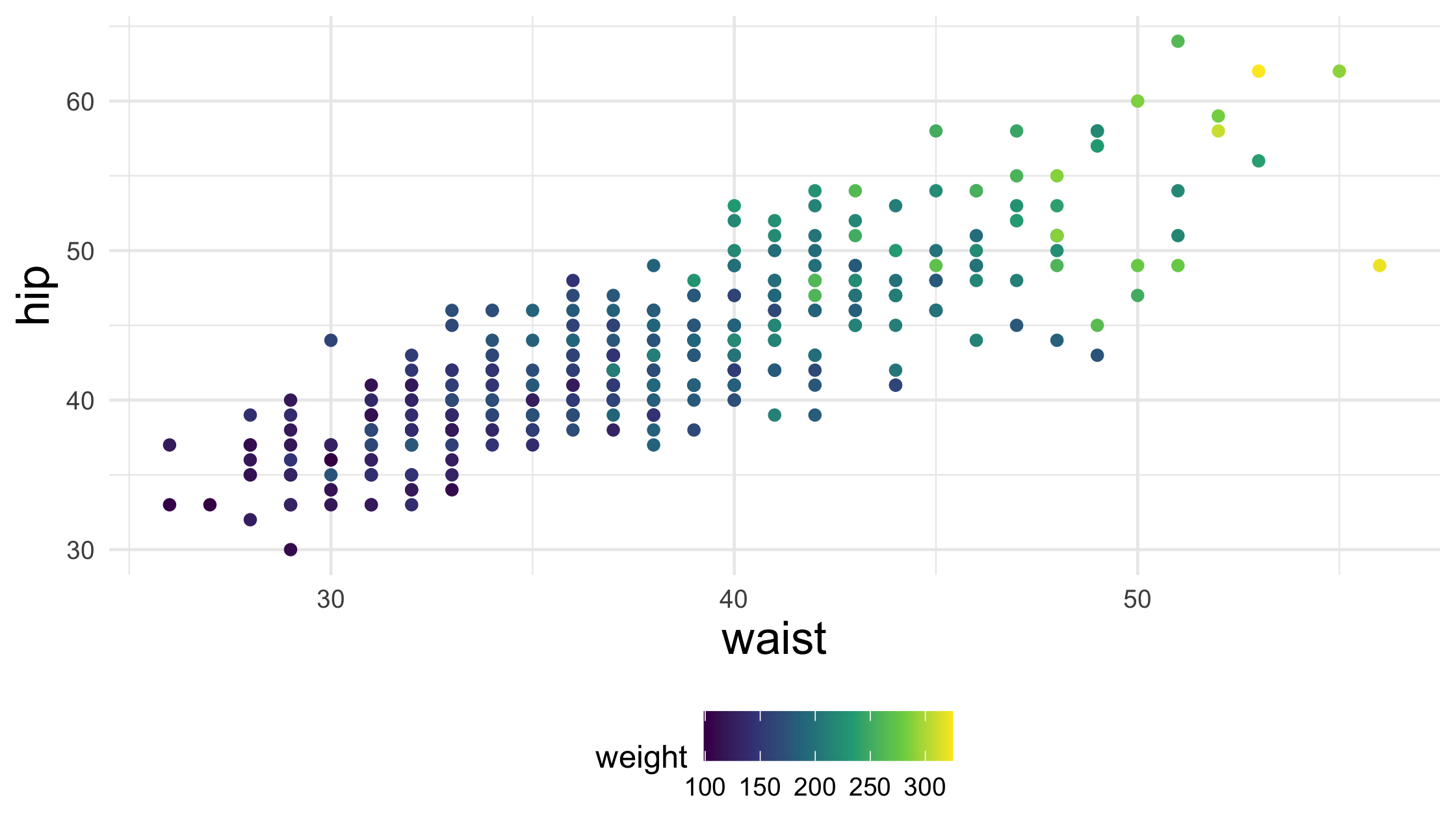
diabetes %>% ggplot(aes(waist, hip, col = weight)) + geom_point() + scale_color_viridis_c()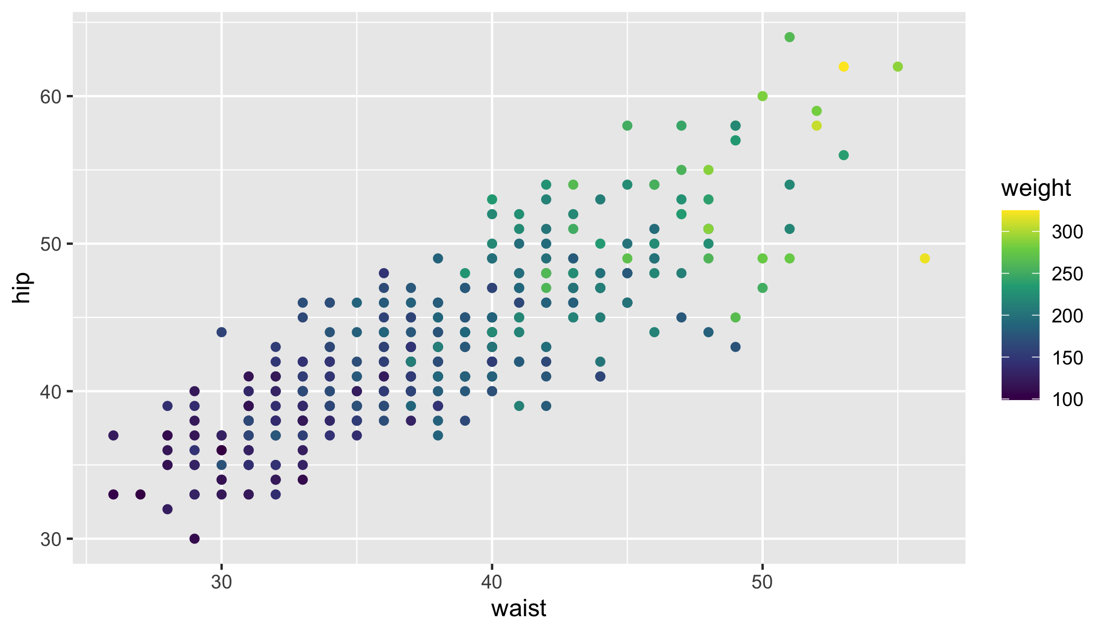
9 / 54
diabetes %>% ggplot(aes(waist, hip, col = gender)) + geom_point() + scale_color_brewer()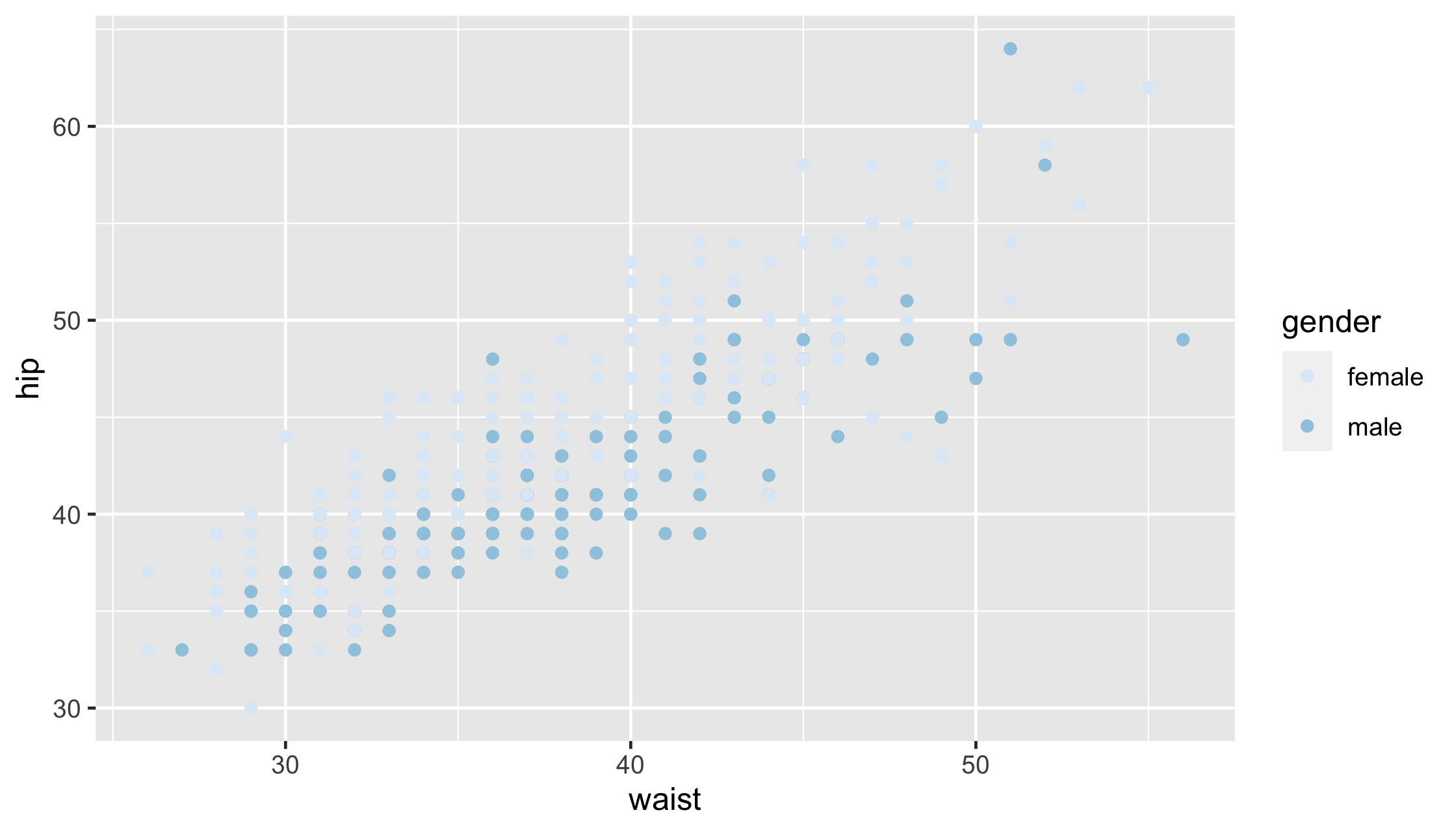
10 / 54
diabetes %>% ggplot(aes(waist, hip, col = gender)) + geom_point() + scale_color_manual(values = c("#E69F00", "#56B4E9"))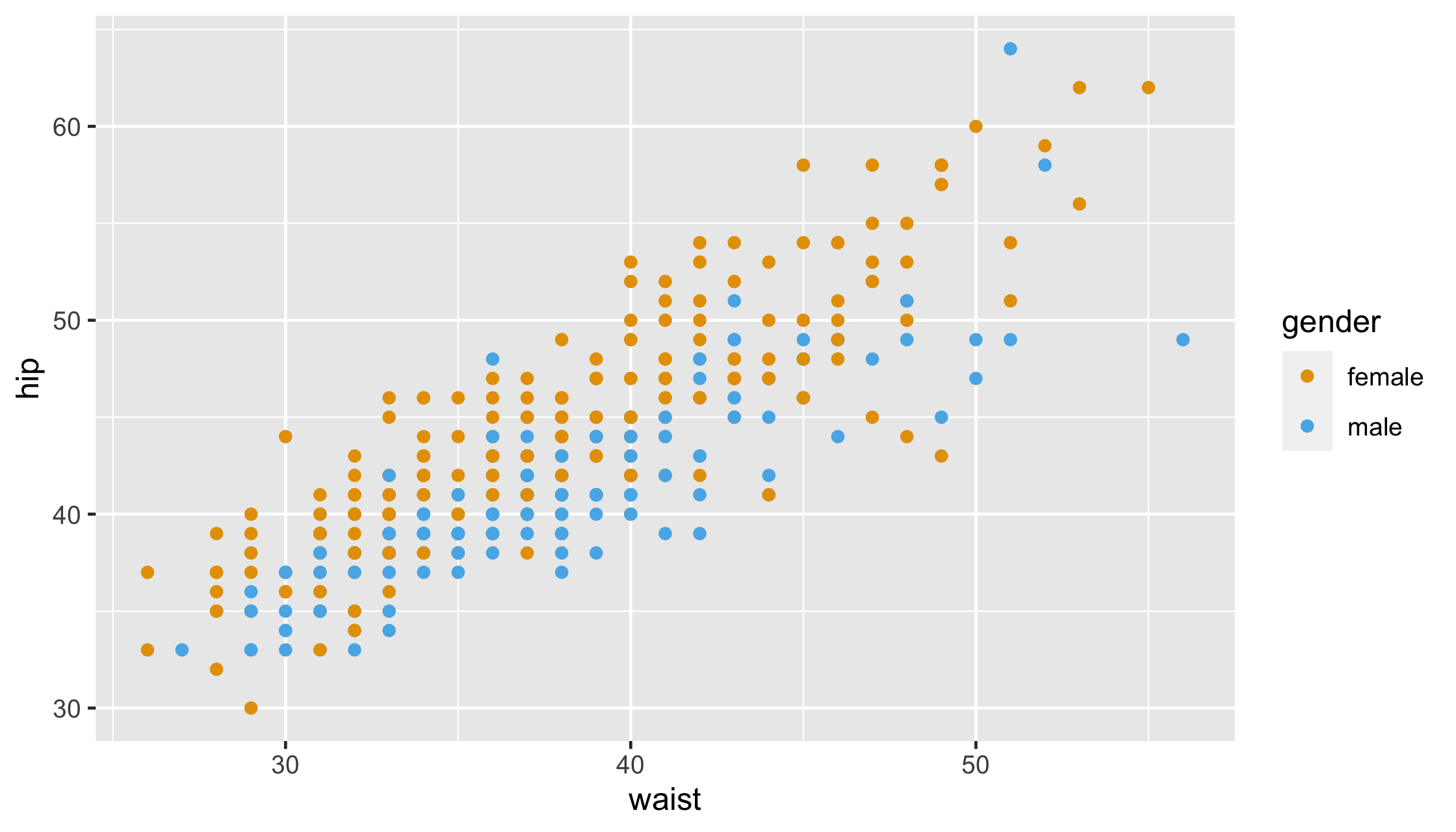
11 / 54
diabetes %>% ggplot(aes(waist, hip, col = gender)) + geom_point() + scale_color_manual(name = "Sex", values = c("#E69F00", "#56B4E9"))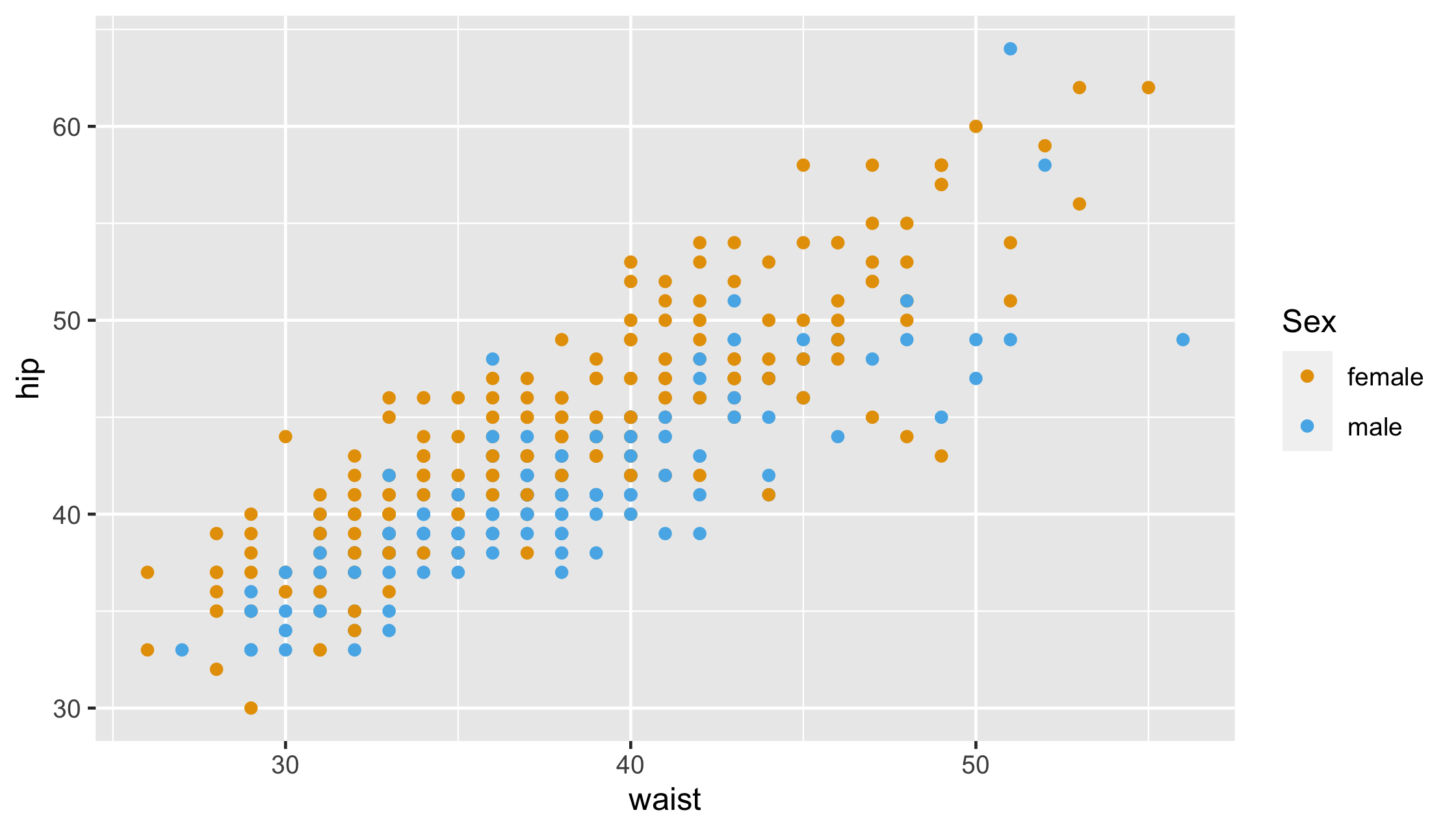
12 / 54
Themes
14 / 54
Themes
Non-data ink (text, background, etc)
14 / 54
Themes
Non-data ink (text, background, etc)
Pre-specified themes: theme_gray() (default), theme_minimal(), theme_light(), etc.
15 / 54
Themes
Non-data ink (text, background, etc)
Pre-specified themes: theme_gray() (default), theme_minimal(), theme_light(), etc.
theme_gray() (default), theme_minimal(), theme_light(), etc.theme()
16 / 54
mtcars %>%ggplot(aes(hp, mpg, col = factor(cyl))) + geom_point(size = 3) + scale_x_log10() + scale_colour_brewer(name = "Cylinders", palette = "Set2") + theme_minimal() + theme( axis.text = element_text(size = 16), legend.text = element_text(size = 8, face = "bold"), legend.direction = "horizontal" )17 / 54
mtcars %>% ggplot(aes(hp, mpg, col = factor(cyl))) + geom_point(size = 3) + scale_x_log10() + scale_colour_brewer(name = "Cylinders", palette = "Set2") + theme_minimal() + theme( axis.text = element_text(size = 16), legend.text = element_text(size = 8, face = "bold"), legend.direction = "horizontal" )18 / 54
mtcars %>% ggplot(aes(hp, mpg, col = factor(cyl))) + geom_point(size = 3) + scale_x_log10() + scale_colour_brewer(name = "Cylinders", palette = "Set2") + theme_minimal() + theme( axis.text = element_text(size = 16), legend.text = element_text(size = 8, face = "bold"), legend.direction = "horizontal" )19 / 54
mtcars %>% ggplot(aes(hp, mpg, col = factor(cyl))) + geom_point(size = 3) + scale_x_log10() + scale_colour_brewer(name = "Cylinders", palette = "Set2") + theme_minimal() + theme( axis.text = element_text(size = 16), legend.text = element_text(size = 8, face = "bold"), legend.direction = "horizontal" )20 / 54
mtcars %>% ggplot(aes(hp, mpg, col = factor(cyl))) + geom_point(size = 3) + scale_x_log10() + scale_colour_brewer(name = "Cylinders", palette = "Set2") + theme_minimal() + theme( axis.text = element_text(size = 16), legend.text = element_text(size = 8, face = "bold"), legend.direction = "horizontal" )21 / 54
mtcars %>% ggplot(aes(hp, mpg, col = factor(cyl))) + geom_point(size = 3) + scale_x_log10() + scale_colour_brewer(name = "Cylinders", palette = "Set2") + theme_minimal() + theme( axis.text = element_text(size = 16), legend.text = element_text(size = 8, face = "bold"), legend.direction = "horizontal" )22 / 54
23 / 54
theme elements
| element | draws |
|---|---|
| element_blank() | nothing (remove element) |
| element_line() | lines |
| element_rect() | borders and backgrounds |
| element_text() | text |
24 / 54
Your Turn 11
1. Change the theme using one of the built-in theme functions.
2. Use theme() to change the legend to the bottom with legend.position = "bottom".
3. Remove the axis ticks by setting the axis.ticks argument to element_blank()
4. Change the font size for the axis titles. Use element_text(). Check the help page if you don't know what option to change.
diabetes %>% ggplot(aes(waist, hip, col = weight)) + geom_point() + scale_color_viridis_c()25 / 54
diabetes %>% ggplot(aes(waist, hip, col = weight)) + geom_point() + scale_color_viridis_c() + theme_minimal() + theme( legend.position = "bottom", axis.ticks = element_blank(), axis.title = element_text(size = 16) )26 / 54
27 / 54
High-density plots
?rnorm, ?Distributions
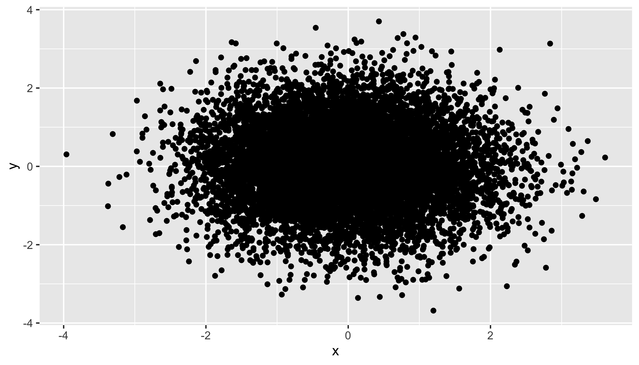
big_data <- tibble(x = rnorm(10000), y = rnorm(10000))28 / 54
High-density plots
big_data %>% ggplot(aes(x, y)) + geom_point()29 / 54
High-density plots
30 / 54
High-density plots
Transparency
Binning
31 / 54
big_data %>% ggplot(aes(x, y)) + geom_point(alpha = .05)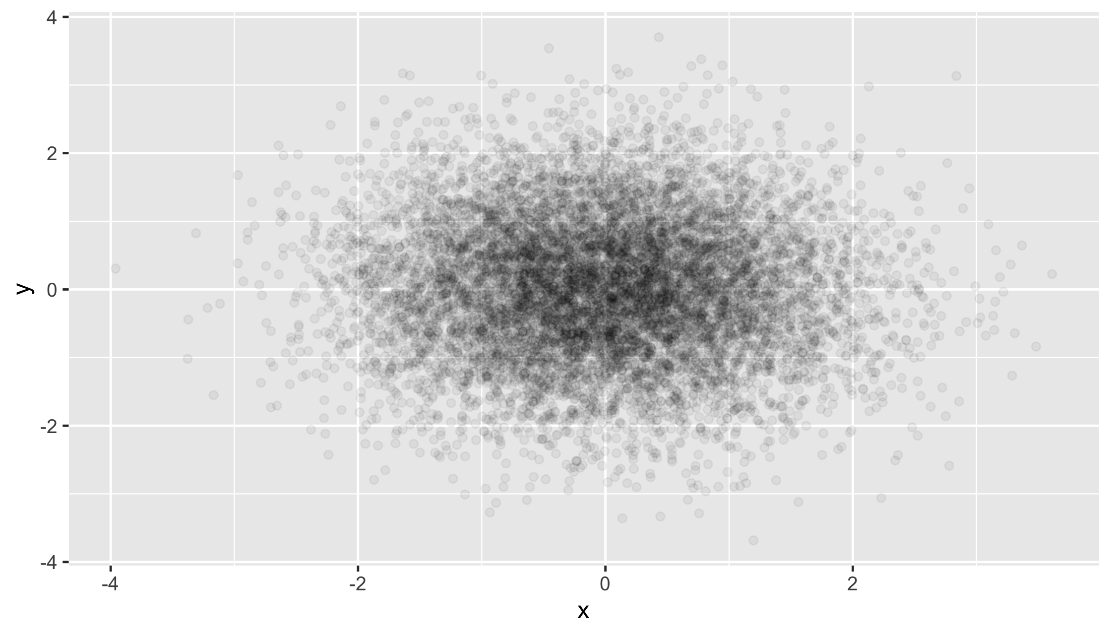
32 / 54
big_data %>% ggplot(aes(x, y)) + geom_bin2d()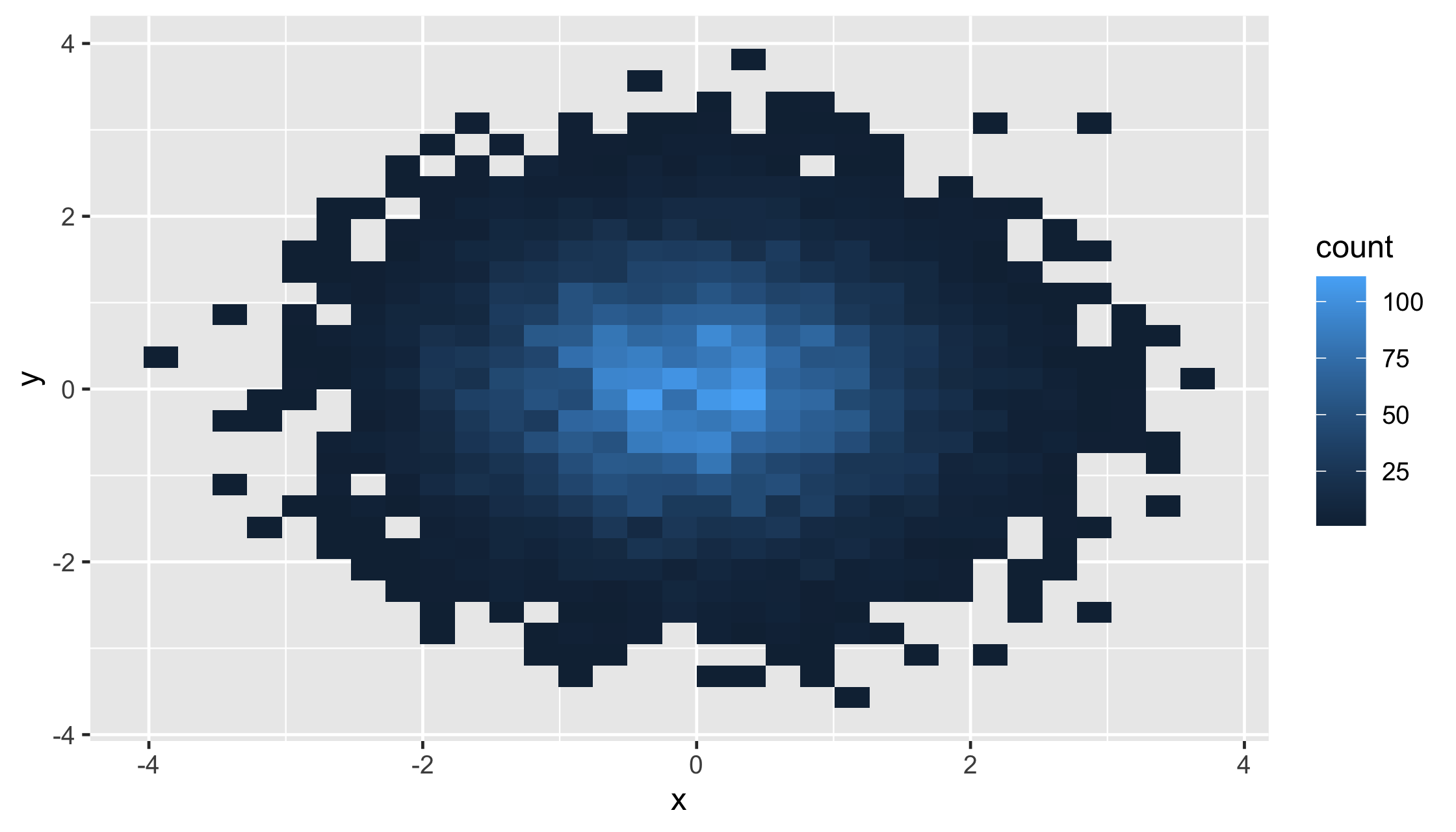
33 / 54
big_data %>% ggplot(aes(x, y)) + geom_hex()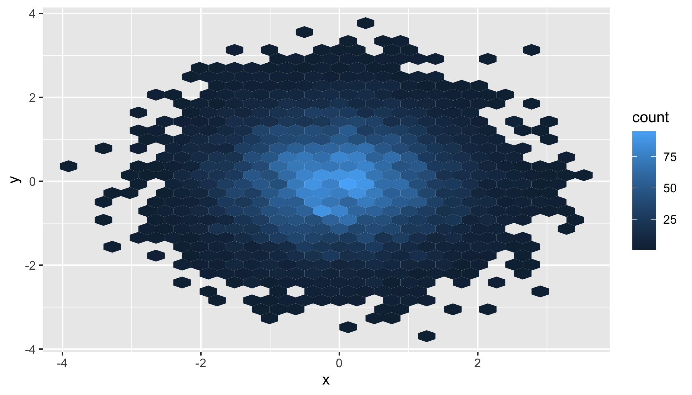
34 / 54
Your Turn 12
Take a look at the diamonds data set from ggplot2. How many rows does it have?
diamonds1. Make a scatterplot of carat vs. price. How's it look?
2. Try adjusting the transparency.
3. Replace geom_point() with 2d bins.
4. Try hex bins.
35 / 54
diamonds %>% ggplot(aes(x = carat, price)) + geom_point()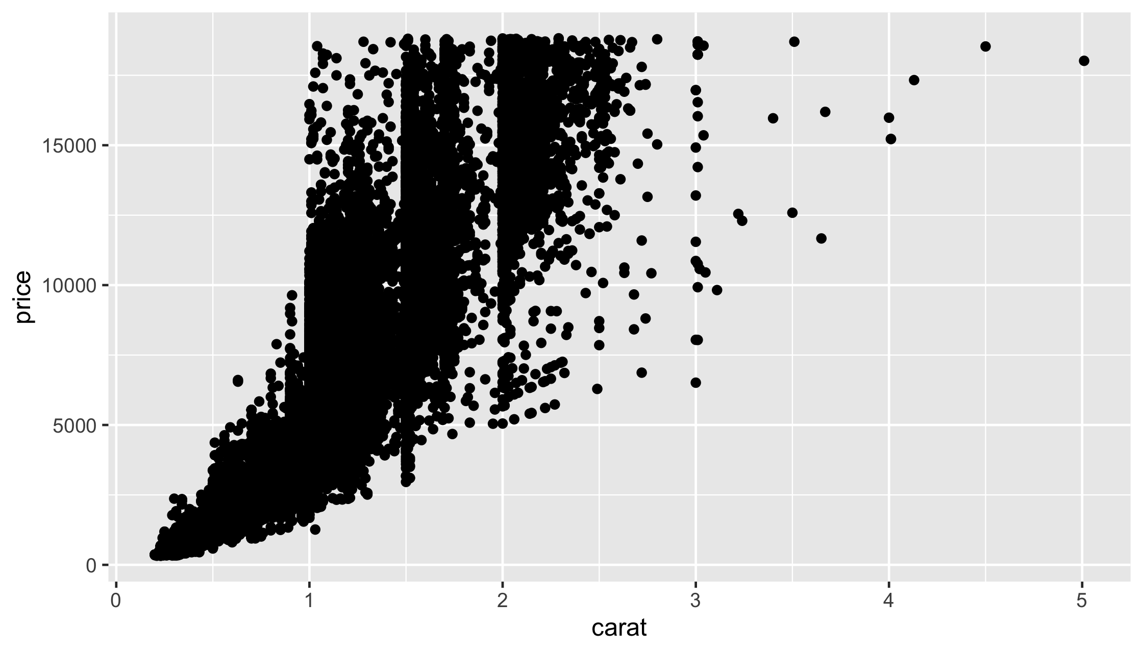
36 / 54
diamonds %>% ggplot(aes(x = carat, price)) + geom_point(alpha = .05)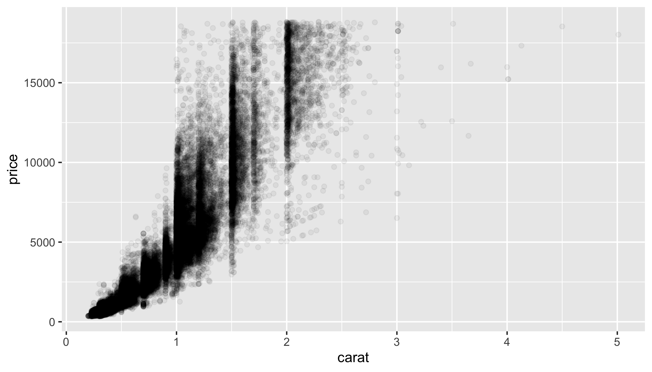
37 / 54
diamonds %>% ggplot(aes(x = carat, price)) + geom_bin2d()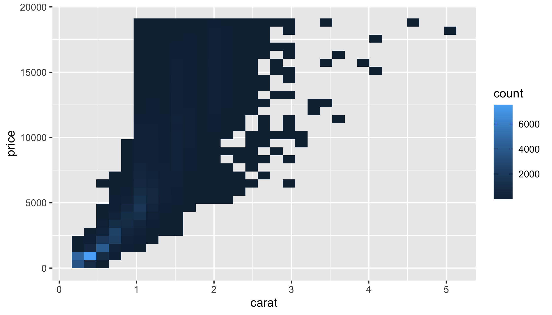
38 / 54
diamonds %>% ggplot(aes(x = carat, price)) + geom_hex()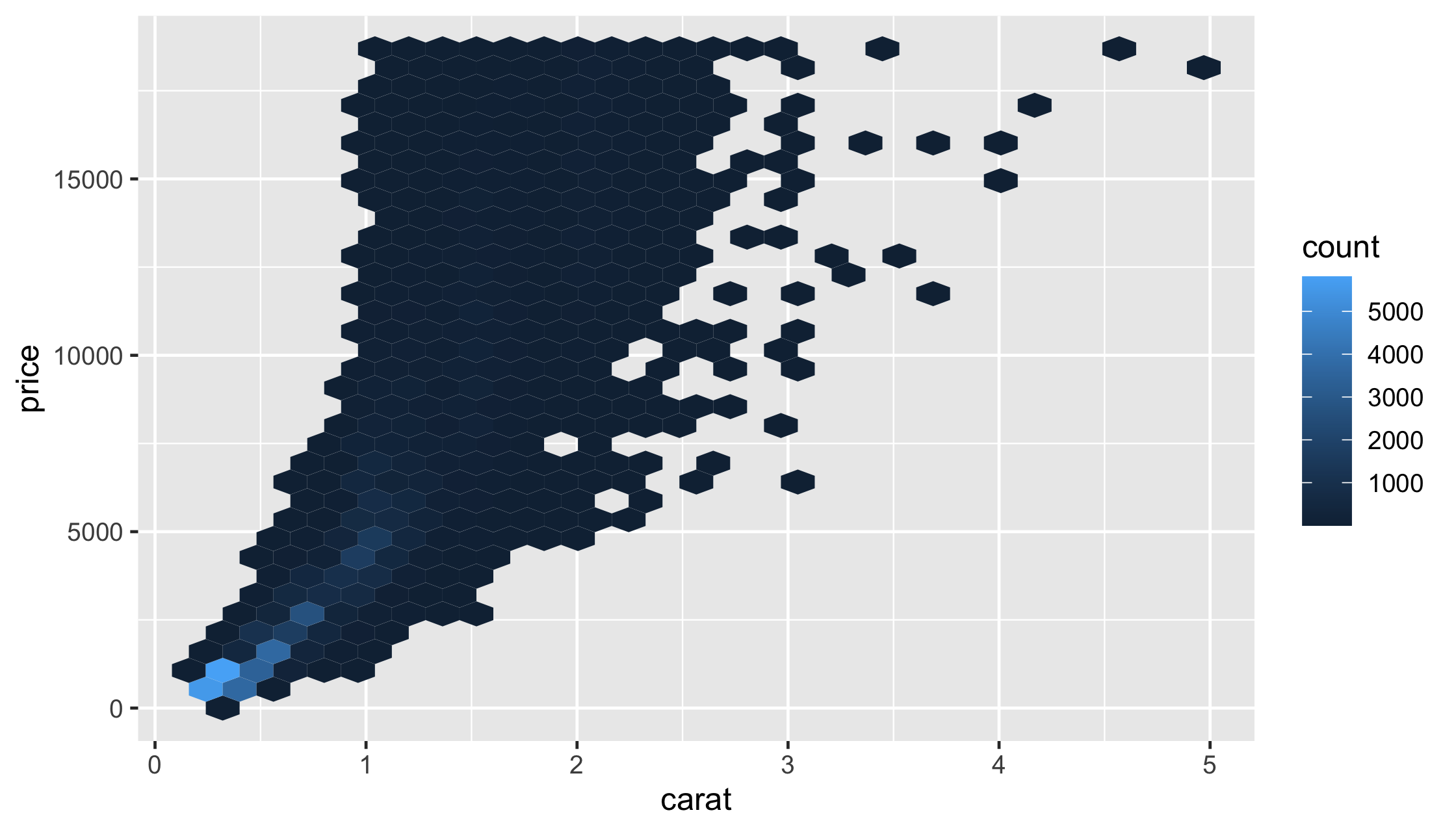
39 / 54
Labels, titles, and legends
40 / 54
Labels, titles, and legends
Add a title:
ggtitle()
labs(title = "My Awesome Plot")
41 / 54
Labels, titles, and legends
Change a label:
xlab(), ylab()
labs(x = "X Label", y = "Y Label")
42 / 54
Labels, titles, and legends
Change a legend:
scale_*() functions
labs(color = "Wow, labs does everything", fill = "Yup")
43 / 54
Labels, titles, and legends
Change a legend:
scale_*() functions
scale_*() functionslabs(color = "Wow, labs does everything", fill = "Yup")
labs(color = "Wow, labs does everything", fill = "Yup")Remove the legend: theme(legend.position = "none")
44 / 54
Your Turn 13
1. Add a title.
2. Change the x and y axis labels to include the unites (inches for hip and pounds for weight). You can use either labs() or xlab() and ylab()
3. Add scale_linetype() and set the name argument to "Sex".
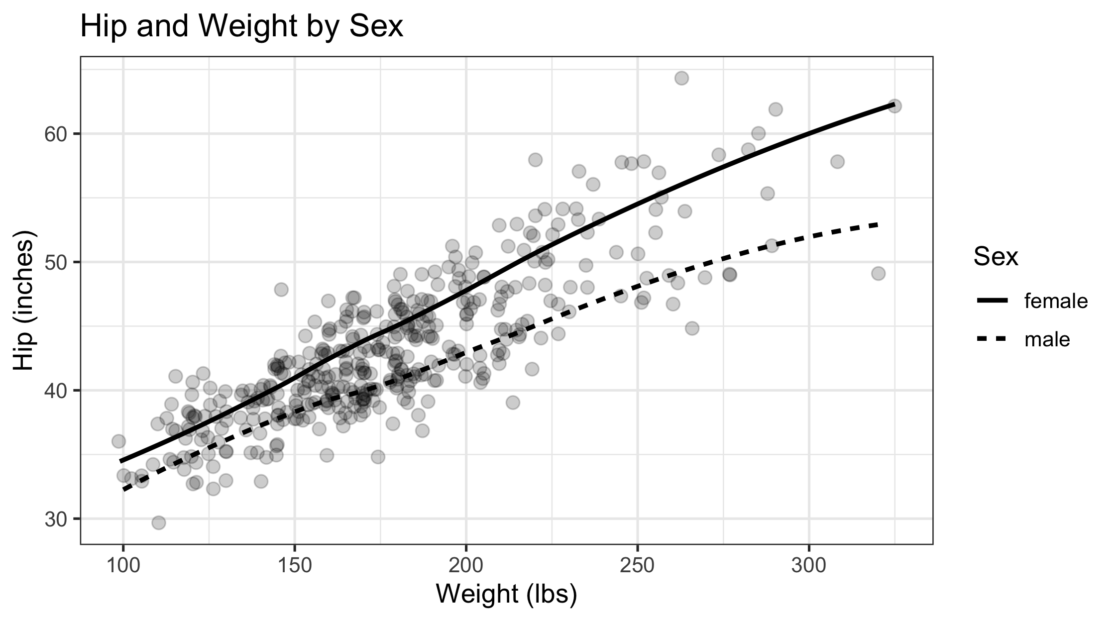
ggplot(diabetes, aes(weight, hip, linetype = gender)) + geom_jitter(alpha = .2, size = 2.5) + geom_smooth(color = "black", se = FALSE) + theme_bw(base_size = 12)45 / 54
ggplot(diabetes, aes(weight, hip, linetype = gender)) + geom_jitter(alpha = .2, size = 2.5) + geom_smooth(color = "black", se = FALSE) + theme_bw(base_size = 12) + labs(x = "Weight (lbs)", y = "Hip (inches)") + ggtitle("Hip and Weight by Sex") + scale_linetype(name = "Sex")46 / 54
47 / 54
ggplot(diabetes, aes(weight, hip, linetype = gender)) + geom_jitter(alpha = .2, size = 2.5) + geom_smooth(color = "black", se = FALSE) + theme_bw(base_size = 12) + labs( title = "Hip and Weight by Sex", x = "Weight (lbs)", y = "Hip (inches)", linetype = "Sex" )48 / 54
Saving plots
49 / 54
Saving plots
ggsave(filename = "figure_name.png", plot = last_plot(), dpi = 320)
49 / 54
Your Turn 14
Save the last plot and then locate it in the files pane.
50 / 54
Your Turn 14
Save the last plot and then locate it in the files pane.
ggsave("diabetes_weight_hip.png", dpi = 320)51 / 54
Take aways:
You can use this code template to make thousands of graphs with ggplot2.
ggplot(data = <DATA>, mapping = aes(<MAPPINGS>)) + <GEOM_FUNCTION>() + <SCALE_FUNCTION>() + <THEME_FUNCTION>()52 / 54
53 / 54
Resources
R for Data Science: A comprehensive but friendly introduction to the tidyverse. Free online.
RStudio Primers: Free interactive courses in the Tidyverse
Data Visualization: A Practical Introduction: Mostly free online; great ggplot2 intro
54 / 54